|
|
|
Showing 111 - 120 of ~2785 |
| Image |
Comment |
| 01/01/2006 08:12:29 PM | Bubblesby Meridian SageComment: You'll have to forgive me if I completely miss the connection to the challenge here. I have thought of 'mother' in every sense I can think of, and not once do bubbles cross my mind. The shot is neat. I like the bubbles, and the color is amazing. Focus on the bubbles is nice and crisp, and DOF is appropriate. The photo just says nothing about Mother to me. Sorry. ~Heather~ |  Photographer found comment helpful. Photographer found comment helpful. |
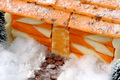
| 12/27/2005 10:58:34 AM | Welcome to our Cheesy Home!by CaitlynComment: *Critique Club*
Adorable set up. Right down to a little door knob. Good work. I like the way the roof actually looks like shingles, and I like the added snow. Is that cheese or actual snow? Maybe a shake or 2 of parmesan cheese would have been cute too. Actually, looks like a shake of cheese on the roof, but snow on the ground.
The only real issue I have with the photo is that the focus seems soft to me. Now, I have taken a photo of cheese for a challenge and it turned out soft looking no matter how hard I tried and by looking at a lot of the entries, I think it's just maybe the texture of the cheese that makes it look like it's out of focus, when maybe it really isn't.
So...Not sure which is the case here.
Lighting appears to be good. No distracting shadows or bright spots. Nothing distracting there.
I like the addition of the little walkway and the trees. I think this gives it a very realistic appearance.
Overall a fun image that is technically well done and very creative. Wish I could offer some advice on how to make it appear more crisp, but my attempt on cheese failed in that department too.
~Heather~ | | Photographer found comment helpful. |
| 12/27/2005 10:15:24 AM | Buffet Openby dpdunneComment: *Critique Club*
Since you did not offer any photographer's comments when asking for a detailed critique, I can only offer my critique based upon personal opinion, rather than your actual intent.
I am assuming that your intent was to take a creative photo of cheese. By looking at the challenge, cheese on a mousetrap might have been creative, however, not very original.
The mouse hole appears to be VERY small in relation to the traps and the cheese, and actually looks like it was drawn onto the wall rather than being a hole IN the wall. If it's an actual hole, then I think maybe different lighting would have helped to inhance the appearance of depth in the hole.
The photo is very clean. nice focus, no clutter, and nice arrangement. The shadows on the other hand, kind of decrease that cleanliness. It creates enough distractions that it almost seems busy.
Focus and clarity are ok. I like the detail that we get in the cheese.
The background works nicely as well. Nice color in the upper 1/2, seperated by a nice diagonal line with a darker lower 1/2. Works nicely.
Overall a fun photo, which could benefit from different lighting to reduce shadows. ~Heather~ |
| 12/19/2005 09:08:34 AM | Inner Sanctumby RikkiComment: The photo itself seems to be lacking something that draws me in and holds my attention. Since I am not a religious person, I can share no personal feelings/opinions of the photo. The main subject seems to be the candles, which is good for the challenge, but the glass in the back is too out of focus to really add to the photo. If it had been in focus, then I think the attention would be taken away from the candles, so you made a good choice, but in this case, I find the glass more of a distraction.
Focus on the candles is good. No complaints there. Color is good. Technically, it's an alright photo, just not something I'm drawn to.
Hope this helps. ~Heather~ | | Photographer found comment helpful. |
| 12/15/2005 03:44:54 PM | ________by TheLittleIslandComment: Originally posted by TheLittleIsland:
The yellow lighting was actually accentuated in photoshop A LOT. I wanted the shot to look a little soft.... The dollar sign was something that I could not move, though I hardly think it's as distracting as you make it out to be. I think the eye heads right for the subject on the left due to the halo around his head that I planned out. Also... it's supposed to be ODD so you wouldn't want a smooth nice photo without distractions. |
Thank you for the explaination. It would have been very helpful to know what your intent was while doing the critique, since there were no photographers comments, I could only base my critique on personal opinion and guessing as to what your intent was. By your comments, I think you did a very good job at achieving what you set out to do. | | Photographer found comment helpful. |
| 12/14/2005 10:00:14 PM | Got Cheese?by fotomann_foreverComment: I don't even know what to say. The background is distracting?? I wish the cheese were unwrapped. Good lighting. The pants look dirty to the right of the photo, minor distraction. Oh, and interesting interpretation of cheese. | | Photographer found comment helpful. |
| 12/12/2005 09:04:05 AM | Italianby HBunchComment: Yes, it is a Silver fork. The ones you only bring out on Christmas. And of course to take photos for challenges. lol Thanks for your comments, much appreciated. |
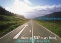
| 12/09/2005 09:12:16 AM | success is one keychain away..by krizedasComment: *Critique Club*
Location 'fotoshop' says it all. I don't know what's real on this image and what's not. I'm finding it very difficult to critique this image, but I will do my best.
The text, which is obviously a violation of the challenge rules, takes up a large part of the photo and makes what seems like a beautiful scene cluttered. Especially with the fotolog link and your name which breaks the anonnyminity of the challenge.
The words don't make much sense. It says 'there is no way back' with an arrow pointing inward the photo. However, there is the other side of the road back.
The upper half of your photo is blown out and too bright in my opinion as well. The blown out area doesn't add to the photo in any way. It erases detail in the sky and trees, that I feel would be an important part of the photo.
Focus also seems too soft. The focus on the road is ok, but it's just not enough to make the rest of the photo interesting. I think I would like to see the grass or the trees or something else in focus.
Overall it's just not an appealing image. Sorry.
~Heather~ |
| 12/09/2005 07:42:56 AM | Rite of Passageby quark314Comment: *Critique Club*
I think this is an excellent idea and hits the challenge perfectly. The only real problem for me, is that it's just not a visually appealing photo. Technically, I think it's well done. Good focus and clarity. We get nice details in the words and we get to see the humor in the shot.
Lighting is good, there are no horrible hot spots or distracting shadows. I think that's really important because of the words, if you get bad lighting, all the words would be unreadable and this shot wouldn't have as much humor value.
I do think it's a bit crowded. I think one of the pencils and the other 1040 form on the right could be removed without hurting the photo. It just seems like too many items crammed into the photo and feels very set up. TOO set up. Of course, I'd have to actually SEE it without the pencil and paper to determine if it looks better that way, or if it then seems to be missing something, but definately it seems like it's too forced.
Overall, it's technically good and a great idea, just lacking some visual punch.
~Heather~ | | Photographer found comment helpful. |
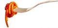
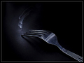
| 12/04/2005 09:46:53 PM | Forkby RikkiComment: nice focus on the fork. I like that this has a dark background, and not the same ol white background we keep seeing (including my entry) Do the white lines have signifigance? Looks like smoke, but can't see where the smoke would be coming from. Are the tips of the fork burned? They do seem a bit darker than the rest. I like the slight texture of the background. I think it adds to this photo. I also like the light lines on the handle of the fork, I think having then come out of the corner is interesting, although my eyes keep following then out of the photo because they are so prominent. Still a very clean shot, and it's pleasing to look at although I don't fully understand it's meaning. ~Heather~ | | Photographer found comment helpful. |
|
Showing 111 - 120 of ~2785 |
Home -
Challenges -
Community -
League -
Photos -
Cameras -
Lenses -
Learn -
Help -
Terms of Use -
Privacy -
Top ^
DPChallenge, and website content and design, Copyright © 2001-2025 Challenging Technologies, LLC.
All digital photo copyrights belong to the photographers and may not be used without permission.
Current Server Time: 04/09/2025 07:59:57 AM EDT.
|