| Image |
Comment |
| 02/09/2003 12:19:47 AM |
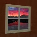
Reflection of days endby togtogComment: I would like to thank everyone for their comments. The way I made the above picture was; I took a new picture of my brothers bedroom window from outside. I then cut out the glass parts, and added the sunset photo (that I took a few months ago) as the layer under that. I then blurred the edges of the window panes to blend them with the sunset, so it didn't look as edited. I then darkened the bottom two panes in another layer to look like the screen, and added the fogging in yet another layer. I think the over all look is pleasing and what I wanted, but I wish I would have rotated the sunset slightly to align it better.
Thank you again for your helpful comments, I hope to learn from them and do better the next time. Cheers!
|
| 01/27/2003 03:01:31 AM |
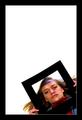
Life inside the Frameby arnitComment: Nice use of a border that adds to the frame she is holding. I think the white part of the border should have been removed though as it is only visible in the corner. It conflicts with the lack of a white inside edge on the frame she is holding. 6 |
| 01/27/2003 02:58:35 AM |
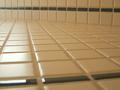
Square line tilesby justineComment: Hmm, this doesn't seem visually appealing to me. The DOF is too short here. While the center is in focus the edges are drawing my eye from it. Sorry, 5 |
| 01/27/2003 02:53:22 AM |
Sound Worksby ManicComment: This is very pretty, I love the glowing effect. Seems it could have gained from a slightly longer DOF, little fuzzy in the back. While pretty, and square it doesn't capture me the way some of the other photos today have, sorry. 6 |
 Photographer found comment helpful. Photographer found comment helpful. |
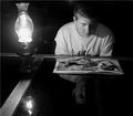
| 01/27/2003 02:49:18 AM |
Fifteen?by steinarknutsenComment: I love this, the reflection makes it look like two sets of pieces stacked on the surface yet it is only one. The colors compliment each other perfectly too. I'm not sure if I understand the title however. 7 |
| Photographer found comment helpful. |
| 01/27/2003 02:45:41 AM |
|
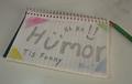
| 01/21/2003 03:11:09 PM |
Humor, tis funny!by togtogComment: I would like to thank all of you for your comments on this photo. I found most of them helpful. As for the contrast I'm not sure what exactly happened, I'm sure it was brighter then this, but my original is dark too (d'oh!). I will try to be more careful in the future. This was a difficult challenge, I hope to have better luck next time.
Cheers!
|
| 01/05/2003 07:50:44 PM |
A Dogs Lifeby togtogComment: Yes, togtog did indeed screw up the photo by playing with the contrast settings in Paintshop with a misconfigured monitor. Oh poo...
|
| 01/03/2003 02:54:25 PM |
|
| Photographer found comment helpful. |
| 12/24/2002 07:39:54 AM |
Nature's Bandageby GeneralEComment: I can't make out what this is supposed to be, from the title I would say a scab but it doesn't look like that to me, sorry. - togtog |
Home -
Challenges -
Community -
League -
Photos -
Cameras -
Lenses -
Learn -
Help -
Terms of Use -
Privacy -
Top ^
DPChallenge, and website content and design, Copyright © 2001-2025 Challenging Technologies, LLC.
All digital photo copyrights belong to the photographers and may not be used without permission.
Current Server Time: 04/07/2025 06:08:51 AM EDT.