| Image |
Comment |
| 08/02/2010 11:50:14 PM |
|
| 08/01/2010 10:13:33 PM |
|
 Photographer found comment helpful. Photographer found comment helpful. |
| 08/01/2010 07:43:13 PM |
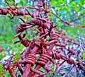
Barb Wire.by mrbig65Comment: I really like the barb wire and I really don't like the greens.
Drop the sat a bit and lightness on the greens channel and this would be a much more interesting pic. |
| Photographer found comment helpful. |
| 08/01/2010 07:40:56 PM |
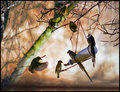
Daisy Daysby reneekerrComment: Interesting. The effect on the background looks like the bg was moving in a line. Almost like someone was moving it, rather than wind. I don't think that was an intended effect, but it gave me a good idea and I'm going to try it!
Nice. |
| Photographer found comment helpful. |
| 08/01/2010 07:32:32 PM |
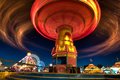
State Fairby daevansComment: I actually really like this. I think it's just the right amount of blur.
What I would like to see a bit different is the bottom edge. A bit of lens correction might make it a bit more comfortable for me or maybe just a crop up a tiny bit.
Still, the rest of the pic is excellent. |
| Photographer found comment helpful. |
| 08/01/2010 07:27:31 PM |
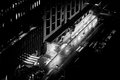
Like Time And Tides...by Covert_OddityComment: Not sure where this pic is going. Nothing in particular to tell me why you took this pic other than the fact that the light was on in front of that building. |
| Photographer found comment helpful. |
| 08/01/2010 07:25:02 PM |
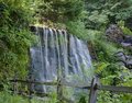
Cutalossa Fallsby jerseyjimComment: I wonder how much fun you could have with this by applying an effect like gothic glow or a fun HDR type style.
You have a very good starting point from the camera. |
| 08/01/2010 07:22:59 PM |
Reaching for the Lightby izadoodleComment: Now this is very well done. No complaints here. It doesn't have a strong emotional connection for me, but it's still very good. |
| Photographer found comment helpful. |
| 08/01/2010 07:21:19 PM |
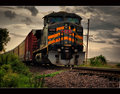
Kansas City Southernby tfarrell23Comment: This has a very good feel, but could use a bit more attention in PS to my eye.
The top part of the engine is darkened in a way that looks like you applied a gradient or something over the whole top. There's a bright spot directly in front of the train that doesn't lend to the pic. The clouds are good, but not consistent. Also, the front of the train is very dominant in the pic's theme, but loses out in composition. I wonder if the bottom was cropped up just to the bottom of that frond that reaches out in the center...
I quite like it in general though. |
| Photographer found comment helpful. |
| 08/01/2010 07:15:07 PM |
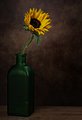
morning teaby sulamkComment: Very nicely done. I'm sure this will do poorly here, but the treatment of colors and shapes is excellent. I find some of the white lichen a bit distracting, but in general, it has a very good feel. (7) |
| Photographer found comment helpful. |
Home -
Challenges -
Community -
League -
Photos -
Cameras -
Lenses -
Learn -
Help -
Terms of Use -
Privacy -
Top ^
DPChallenge, and website content and design, Copyright © 2001-2025 Challenging Technologies, LLC.
All digital photo copyrights belong to the photographers and may not be used without permission.
Current Server Time: 04/07/2025 06:12:55 AM EDT.