| Image |
Comment |
| 06/15/2012 07:46:27 AM |
Behind blue eyes.....by knikkiComment: And it is beautiful. No need for fancy reflectors on this one. It's got a close, intimate feel and nice use of cool tones. |
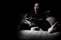
| 06/15/2012 07:40:58 AM |
A Dead End Lifeby knikkiComment: I like this! I tend to be somewhat morbid though, so maybe that is just me.
Also, I like the soft lighting reflected on the floor.
I think the wineglass would be more effective as a wine bottle instead perhaps. Just a bit less DOF might have worked too. Maybe a cool filter and a bit of desat in the reds would have been an interesting alternative too.
I wouldn't worry about the score. This kind of topic seldom does well. |
| 06/15/2012 07:35:28 AM |
Spiderwebs - the harshest environment for a flyby RyanWComment: Good stuff. The background really is the strongest part, with the spider being close to the right amount of blur and the fly being half-way there.
Also feels a bit grainy, like there is a bit too much crop, but that's forgiveable. |
 Photographer found comment helpful. Photographer found comment helpful. |
| 06/15/2012 07:32:43 AM |
|
| Photographer found comment helpful. |
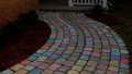
| 06/15/2012 07:29:51 AM |
Colored Stonesby RyanWComment: this is cute. It would be fun to see some toy camera effects on this too. I like the underexposure and subdued look. Gives it more a feeling of mystery to me. |
| Photographer found comment helpful. |
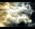
| 06/15/2012 07:27:03 AM |
Good vs. Evilby JamesDowningComment: Grand. In the thumbnail, I thought there was a face hiding behind the light, but seeing that it is the sun behind clouds, I'm wrong, but not disappointed.
What really makes this (aside from the coloring) is the change in texture of the cloud shapes which seem more flowing and dynamic on the left and static and unmoving on the right. Pretty good stuff! |
| Photographer found comment helpful. |
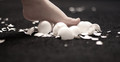
| 06/15/2012 07:23:17 AM |
Floaties°by JamesDowningComment: I don't even really know for sure what I'm looking at, but I think I like what I see. It could be pennies tossed in the air, or microorganisms under a microscope. I could be looking from pretty much any vantage point in any direction. It makes me feel ungrounded and uncertain about where I actually am.
So that's pretty much got it exactly right then. Message edited by author 2012-06-15 11:24:58. |
| Photographer found comment helpful. |
| 06/15/2012 07:17:50 AM |
May15by MarkBComment: Probably my favorite studio type setup in this series, but I'm seeing some very strange, almost posterization-like effects in your lower face. That's not at all a bad thing, and actually, a bit of an oil brush look would make this quite compelling on a business card. Especially with your hair style.
It seems to me that your self portraits seem to have a bit of awkwardness as to what to do with the shoulders. I read a really good article once about the details of classic portraiture and posing. I've forgotten most of it and seldom follow it, but it might be something that will give you some tools to have a bit more control over this feature of your poses. I think it's the fact that you have dropped your shoulder a tiny bit too much in a few shots, which puts you a bit off-kilter. It is barely noticeable in this pic due to the close crop, which is probably why I like it. Squaring the shoulders would make a more 'masculine' pose, dropping the shoulder gives a more 'sensitive' pose. This might be exactly what you wanted to show of yourself in this pic though, so then it would not be a negative feature.
As usual, your lighting is excellent. Message edited by author 2012-06-15 11:21:14. |
| 06/15/2012 07:12:25 AM |
May10by MarkBComment: It's got some good personality in it. The most interesting in your series by far. The face looks a tiny bit washed out, but that might be part of the intended style, and I'm wondering what you're doing with that bag of potato chips (just got caught cheating on your diet?), but nicely laid out and nicely presented.
I think your strength is in your sense of how to use negative space. |
| 06/15/2012 07:06:19 AM |
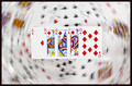
Royally Flushedby MarkBComment: Great idea and nicely executed. I think what really makes this work is the balance of light between the cards in the foreground and the cards in the background. It helps the front cards really stand out.
Excellent. |
| Photographer found comment helpful. |
Home -
Challenges -
Community -
League -
Photos -
Cameras -
Lenses -
Learn -
Help -
Terms of Use -
Privacy -
Top ^
DPChallenge, and website content and design, Copyright © 2001-2025 Challenging Technologies, LLC.
All digital photo copyrights belong to the photographers and may not be used without permission.
Current Server Time: 04/07/2025 06:22:57 AM EDT.