| Image |
Comment |
| 06/14/2008 01:58:37 PM |
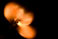
Combustion Chemistryby HillwaaaComment: A great frozen motion photo, the flame is clearly just igniting and I imagine it took a lot of patience to get this just right and framed correctly. What lets this down though is the focus - its just not crisp enough on the match head for my liking. Good idea though and an unusual way of meeting the challenge. 6. |
 Photographer found comment helpful. Photographer found comment helpful. |
| 06/14/2008 01:57:01 PM |
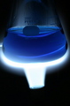
Flaming Blueby wrldtrvlr13Comment: Great concept and meets the challenge very well. The whiteness of the flame adds a mysterious feel and the blue liquid is a strong source of interest for this photo. I'm a little put off though by the negative space to the bottom of the image - it does little to add to the photo since the burner isn't lit at all. 7 from me. |
| Photographer found comment helpful. |
| 06/14/2008 01:54:27 PM |
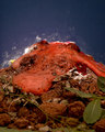
Chemical Reactionby littlegettComment: This is something of a visual feast, but not a feast I'd enjoy so much! Technically well executed, well lit and saturated just the right amount.
I'm struggling to tell whats happening here though, leaves, dirt, red foam and white stuff. I think your photo struggles because it starts with a negative impression which isnt used to any benefit. Many strong images have been produced depicting not-so-nice subject matter but there needs to be an underlying concept or idea stringing this together which is what I think this shot is missing. If there was a purpose to this mess then it would sit better with me and I could enjoy it more but without the purpose it remains chaotic and so I've scored it down a bit.. 4. |
| 06/14/2008 01:47:24 PM |
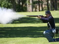
Gunpowderby gminkComment: Gunpowder involves chemistry but I dont think this takes the challenge literally enough and only really loosly fits the challenge. However having said that, its still a good shot in its own right, catching and freezing the action beautifully and isolating the subject with great use of depth of field. Although isolated, my attention is drawn to the fields behind the soldier though as they are brighter and more saturated and the competition for my interest makes my head hurt! To improve, I'd try using some fill flash to make your soldier stand out. A 5 from me. |
| 06/14/2008 01:42:54 PM |
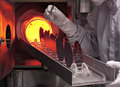
Diffusing Boron @ 950Cby DeniseComment: I think this is certainly one of the more interesting shots from this challenge as it shows actual 'real world' chemistry taking place. So in this sense its very true to the challenge requirements. There are some great elements of interest in this photo, not least that cool looking red yellow lighting in the background.
This is obviously a candid shot and I think it would do well in stock photography, however I'm personally biased as I prefer my photography more in your face and beating you with the interest stick ;) I gave this a 6. |
| Photographer found comment helpful. |
| 06/14/2008 01:36:36 PM |
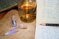
Tools of the Tradeby pipersdComment: The links to chemistry here are obvious, its a nice shot and you have clearly spent some time thinking about the arrangement of the items for the best effect. I find black and white photos particularly subjective, for me contrast is king in them and this is one area I feel this shot falls down slightly. It looks a bit on the flat side to me and the exciting subjects seem a bit boring because of this. I gave this a 5. |
| Photographer found comment helpful. |
| 06/14/2008 01:32:43 PM |
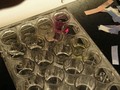
Chem Class Lab: Acid or Base?by Kel27Comment: Acids and bases - classic chemistry embodied. The solo glass with the brigh pink liquid is where your eye immediately homes into and because its surrounded by less interesting subjects it obviously stands out as the focus point of the picture. A few things could improve this shot - your white balance seems off, theres a yellow tinge which makes the photo look muddy. The exposure could do with a little bump too I think as the glass looks a bit on the dull side. Think about the background of your photos too, the black/white surface adds a sense of drama which shouldnt be there given that your subject is the pink vial - a plain colour would have been a better choice. The arrangement of the litmus could have been better too, they look like they were thrown in at the last minute as an afterthought, but visually this is the only thing telling you we're looking at acids and bases so it should have been given more importance. Overall 3. |
| 06/14/2008 01:26:56 PM |
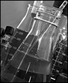
glass tubeby ralphComment: This idea is something of a classic take on chemistry, and is pretty well executed. Its clear to see you've spent some time thinking about the composition and lighting. Exposure, focus and all technical aspects are pretty much dead on but I think one key thing is lacking and that is interest. There's nothing to hold my personal interest in this, so for me its a little easy as a viewer to 'skim over' it and not study the composition etc which is where the beauty of this picture lies. Some ideas to try might be the use of gels to add an extra dimension of interest to your lighting. Play around and see what colours work well. Blue and yellow are a good combination :) I gave this a 6. |
| 06/14/2008 01:17:22 PM |
Modern Chemistryby baileyldComment: All the elements of this photo shout 'Chemistry' to me so you have met the challenge really well, I think you should spend some time thinking about the composition though. The first thing that jumped out was the bottle of acid(?) the label really should be facing forward so we can identify exactly what it is we're looking at. You could also try limiting the amount of objects in the photo and concentrating on the strongest one and isolating this by depth of field. I know these seem like little niggles but when something doesn't quite sit right it spoils the entire effect of the photo. Hope this is some help, 5 from me. |
| Photographer found comment helpful. |
| 06/14/2008 01:13:18 PM |
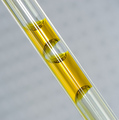
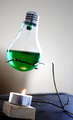
toil and troubleby brownguyComment: This is a great idea for this challenge, and the colour of the liquid inside the bulb is really funky and adds a lot of interest to the shot. I think that your execution of the idea leaves a little to be desired though. A few pointers which could really give this shot an edge are: Think about your background - I find yours in this picture to be quite distracting, the shadow, the blue surface and how it interacts with the white wall behind I find a bit off putting. The angle of the candle and bulb too makes me want to tilt my head. Overall, I give this a 4 - keep at it! :) |
Home -
Challenges -
Community -
League -
Photos -
Cameras -
Lenses -
Learn -
Help -
Terms of Use -
Privacy -
Top ^
DPChallenge, and website content and design, Copyright © 2001-2025 Challenging Technologies, LLC.
All digital photo copyrights belong to the photographers and may not be used without permission.
Current Server Time: 04/07/2025 06:07:55 AM EDT.