| Image |
Comment |
| 02/15/2006 01:51:54 AM |
|
 Photographer found comment helpful. Photographer found comment helpful. |
| 02/15/2006 01:51:00 AM |
|
| Photographer found comment helpful. |
| 09/22/2005 06:58:32 AM |
Flying Highby saracatComment: i'd probably give this shot a 5 or a 6. I like the composition, using the clouds to nicely frame the shot. the colours in the balloon are quite nice and vibrant. only wish is that you had more zoom! blowing that balloon up by 5 times would have boosted the shot up to an 8. (although the scale does give it some perspective on how far it is, but i'm always a sucker for in-your-face kind of detail).
|
| Photographer found comment helpful. |
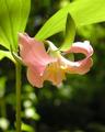
| 09/22/2005 06:56:11 AM |
Catesby's Trilliumby saracatComment: I'd probably give this photo a 3, perhaps a 4 if I were in a good mood. My first impression is that alot more effort could have gone into the preparation of the shot to ensure that the light wasn't so harsh (perhaps using a light reflector to give it some shade?), as there is a LOT of burning along the flower petals, which is the primary point of focus, and the burning, IMO, isn't providing any artistic flair. Also, the colour seems a bit muted or muddy, and the yellow stamens seems to blend in with the pink petals, instead of being more vibrant and popping out. Finally, I think the petals could be a bit sharper in focus, to bring out some of their texture more. |
| Photographer found comment helpful. |
| 09/19/2005 12:44:48 PM |
|
| 09/19/2005 12:43:50 PM |
Con-spiracy?? GIRLspiracy!by BeeGeeComment: pose could be much better to maintain the "idea" but provide better detail on the subjects. no eyes == slightly boring unless artistically implied |
| Photographer found comment helpful. |
| 09/19/2005 12:42:54 PM |
|
| Photographer found comment helpful. |
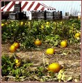
| 09/16/2005 07:29:14 AM |
pumpkinpatch2b.jpgby trobergeComment: i'm going to suggest the opposite of the others... i'm not really enthused about the pumpkins, their alien-glow isn't doing much for me. What I REALLY think stands out in this shot are the wooden crates in the background. I'd crop the top 1/3rd into its own shot.
The top 1/3rd has a nice subtle feel to it. The middle third is WAY too blurry and hurts my eyes (also, no detail, and unnatural colours). The bottom third has potential, but I think there is alot blown out here and the it looks like you neat-image'd them into a nubile enfancy (ie: their skin is a little TOO baby-soft). You've managed to blow out all of the detail which gives this picture "texture" and made it cold instead of the warmth one would imagine from pumpkins (and home-made pumpkin pie as their by-product).
keep the top 1/3rd, drop the rest.
|
| Photographer found comment helpful. |
| 09/15/2005 08:48:55 AM |
|
| Photographer found comment helpful. |
| 09/15/2005 08:48:00 AM |
|
| Photographer found comment helpful. |
Home -
Challenges -
Community -
League -
Photos -
Cameras -
Lenses -
Learn -
Help -
Terms of Use -
Privacy -
Top ^
DPChallenge, and website content and design, Copyright © 2001-2025 Challenging Technologies, LLC.
All digital photo copyrights belong to the photographers and may not be used without permission.
Current Server Time: 04/19/2025 01:40:43 AM EDT.