| Image |
Comment |
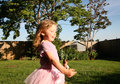
| 12/04/2011 04:58:17 PM |
What happens next...........by DanaSComment: composition is good, but direct flash on a "portrait" shot creates harsh shadows - notice under the arm and especially behind the head. Instead of using flash, opening up the camera to a higher Fstop (lower number) will allow better low light performance without the flash. |
 Photographer found comment helpful. Photographer found comment helpful. |
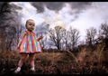
| 12/04/2011 02:04:32 PM |
the coopby nick_hinchComment: compositionally, the photo is well done. Though naming your image the "coop" doesn't make up for the fact your main subject is out of focus. |
| Photographer found comment helpful. |
| 12/04/2011 02:02:19 PM |
Sweetby IvyyComment: I don't understand how this is "Family."
With regards to the technical aspect, it would be best to try and mitigate the harsh reflections. You can do that by using a diffuser or sometimes simply changing your camera angle. |
| Photographer found comment helpful. |
| 12/04/2011 01:45:16 PM |
Mumby Ja-9Comment: Great composition, hope you win |
| Photographer found comment helpful. |
| 03/28/2007 03:41:05 PM |
I Commandby TCGuruComment: I'm sorry, this photo should have been in the top 3!!
|
| Photographer found comment helpful. |
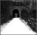
| 01/26/2007 09:23:53 PM |
Snowy Entrance to the Exitby nickbComment: please be careful with the "unsharp mask" the photo is VERY pixelated. composition is off, check your horizion and rotate acordingly. it does nothing but detract in the picture. if you would have centered on the path more, or moved back further and centered, the image would have been stronger. I feel you cropped it this way because you liked the fence on the right side. having an imbalance is good, but not good if it is slightly off. your center line is about 10pixels off... pretty annoying to me anyways... |
| 01/26/2007 09:18:18 PM |
Guitar Playerby airaComment: flash is to harsh. composition is awful: the mic is "on" his head. photo is very "scrapbookish"...
entrance to what? a bookstore? the subject is a guitar player here, how that equates to entrance is beyond me. besides the fact that there is no entrance, the photo isn't of high caliber at all.
the only way to learn is constructive criticism. I hope i'm not the only person that bashes this, but please, you are entering a PHOTO CONTEST, so don't just enter some picture you took during the week that is a passing memory of something gone by. please enter quality pictures. |
| Photographer found comment helpful. |
| 01/26/2007 09:11:13 PM |
Bhaal's Gateby KronusComment: excellent. I feel that if a tad more color were introduced (or saved for that matter) the image would be even better. 8 |
| Photographer found comment helpful. |
| 01/26/2007 09:05:43 PM |
Accessby aznymComment: should be called "no access"! the dish is the wrong way... |
| Photographer found comment helpful. |
| 01/26/2007 09:01:01 PM |
HELL or HEAVEN ?by facesastheycomeComment: please calibrate your monitor. there is tons and tons of noise that can easily be removed with a simple contrast or level tweak :

2.
otherwise this would be a very good photo.... |
| Photographer found comment helpful. |
Home -
Challenges -
Community -
League -
Photos -
Cameras -
Lenses -
Learn -
Help -
Terms of Use -
Privacy -
Top ^
DPChallenge, and website content and design, Copyright © 2001-2025 Challenging Technologies, LLC.
All digital photo copyrights belong to the photographers and may not be used without permission.
Current Server Time: 04/09/2025 07:53:10 AM EDT.