| Image |
Comment |
| 02/17/2004 09:09:41 AM |
|
 Photographer found comment helpful. Photographer found comment helpful. |
| 01/26/2004 05:32:52 AM |
|
| 01/26/2004 05:30:36 AM |
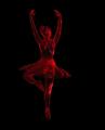
DANCING WITH LIGHTby ColeyComment: I see some major problems here. Did you resize this? In the ballerina there are blocks. That usually occurs when the image was resized improperly. |
| 01/19/2004 06:30:22 AM |
|
| Photographer found comment helpful. |
| 01/16/2004 02:19:50 PM |
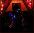
Light Infinityby RoosterComment: From the critique club:
I really like the idea here.
The action is good, it certainly meets the challenge.
Some things that I would change though...
the background is distracting. The picture frame(?) and crocked black line are distracting and take my eye away from the subject.
I'm not sure if you used a tripod here, but the background looks a little blurry which would indicate you might not have.
A tripod and shorter exposure maybe would have helped.
It was a cool, original idea though.
Terry
|
| Photographer found comment helpful. |
| 01/16/2004 02:11:52 PM |
my petit auroraby kenboComment: From the critique club:
OK this is a challenging one to critique.
It would help if i could tell what it is.
I can't tell that it is an action shot in the least.
While the colors are pretty, there is nothing to focus on in the photo, and no way to know what we are looking at.
I think you needed a much shorter shutter speed, and a tripod.
Unless this was your intention, which is possible.
Terry |
| 01/16/2004 02:07:50 PM |
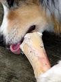
Happiness is an Action wordby amsmythComment: From the critique club:
My first reaction to this shot is that it is too close.
You should you be further back so that parts of his face are not cut off. Right now it's hard to see what is even happening in the photo.
Your lighting seems a bit harsh. Your whites are blown out. Some of that might have been adjusted in post processing, but I find it's difficult to get back details on whites. Better to underexpose a little instead.
Basically, while this is an action shot, the subject focused on(the bone) is not really an action item, and is not so pleasing looking either. Deinitely a different angle of the dog would have improved this.
Terry |
| 01/16/2004 02:01:09 PM |
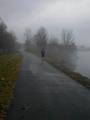
Into the fogby lilnukeeComment: From the critique club:
Nice composition for this shot, allthough I can't decide if I'm bothered by the jogger being so centered. I think I would have preferred it if you caught him earlier in the frame towards the right foreground.
I like the fog, you captured it well.
As far as the challenge, it does meet it, but it is not the strength of the shot. |
| 01/16/2004 01:42:59 PM |
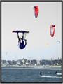
Kite Surferby JaxsonComment: From the critique club:
Here are the positives...
It certainly meets the challenge.
The horizon is straight.
The composition(rule of thirds)and cropping are good.
Here are the negatives...
The color seems off, the main surfer looks too blue in his skin.
The photo is slightly too busy. With all the sails(?) in the sky, my eye has trouble finding the important parts.
Lighting on the main subject could be better.
Terry |
| Photographer found comment helpful. |
| 01/16/2004 10:49:47 AM |
|
Home -
Challenges -
Community -
League -
Photos -
Cameras -
Lenses -
Learn -
Help -
Terms of Use -
Privacy -
Top ^
DPChallenge, and website content and design, Copyright © 2001-2025 Challenging Technologies, LLC.
All digital photo copyrights belong to the photographers and may not be used without permission.
Current Server Time: 04/09/2025 04:59:04 AM EDT.