| Image |
Comment |
| 01/15/2006 07:22:55 PM |
Frosty Foggy Morningby bugsy55Comment: You'll probably hear a lot of this... It's too small. Make the long side 640 pixels to make the most of it. |
 Photographer found comment helpful. Photographer found comment helpful. |
| 12/13/2005 05:46:09 PM |
|
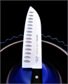
| 12/12/2005 05:43:46 PM |
Ginsu Knifeby Bear_MusicComment: First of all, the background: I like it a lot. The colour and the shape. The composition as a whole, I like too. Maybe too symmetric for some, but I think it works here (I guess you could say the knife is asymmetrical enough). Anyway, my problem is with the knife itself. The edges and the text are a little soft. Perhaps this was the effect you wanted, but I think in that case you'd be better off without the text. Text invites reading, and I find the text just a touch soft to be pleasing, or not soft enough to be interesting. The exposure of the blade seems a little off too. Again, it seems to be too 'middle ground'. There is a little colour/texture/detail to the surface, and I think it might have been better with all or nothing. In that sense, I think it is the slight colouring that bothers me the most, and it might be somewhat improved simply by desaturating the surface of the blade. Just some random thoughts... |
| Photographer found comment helpful. |
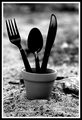
| 12/12/2005 05:07:20 PM |
Home Grownby L1Comment: I like this. I like the DOF, I like the tilt, I like the darkness. I like the bent tine. About the only thing I don't like is the item just behind and to the right of the pot--it is a little distracting. I didn't vote on this challenge, so I can't really say what I would have voted it in that context, but certainly on its own it's a nice shot. |
| Photographer found comment helpful. |
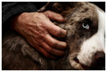
| 12/06/2005 05:25:12 PM |
Masters Handby CalliopeKelComment: Awesome! Great lighting, texture, detail... The only thing I'm not sure about is the composition--In general it's great, but I think I'd like to see all of the dog's head. Then again, maybe not... |
| Photographer found comment helpful. |
| 12/06/2005 05:06:02 PM |
FRAGILEby RikkiComment: Her face looks terribly over-processed... |
| Photographer found comment helpful. |
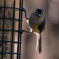
| 12/06/2005 05:04:43 PM |
Titmouse with seedby canyoncatComment: I'm sure others have already said as much, but a little twist counter-clockwise would help. Otherwise, nice job. |
| 12/05/2005 04:23:02 PM |
Lime Greenby hdogg4uComment: It looks a little dried out around the edges to me (this appears to be a pet peeve of mine in photos of citrus fruit). Composition and focus are good though. Perhaps a little too green, but I guess that's the point isn't it... |
| Photographer found comment helpful. |
| 12/05/2005 04:15:29 PM |
King Of The Peacocks!by JudiComment: This seems a touch oversaturated to me. Or maybe the colours really are that impossibly brilliant? Either way, nice shot. |
| Photographer found comment helpful. |
| 12/05/2005 04:12:33 PM |
Monumentsby BethanComment: Aha! Sky colour is a definite improvement since I last saw this... |
| Photographer found comment helpful. |
Home -
Challenges -
Community -
League -
Photos -
Cameras -
Lenses -
Learn -
Help -
Terms of Use -
Privacy -
Top ^
DPChallenge, and website content and design, Copyright © 2001-2025 Challenging Technologies, LLC.
All digital photo copyrights belong to the photographers and may not be used without permission.
Current Server Time: 04/07/2025 06:28:30 AM EDT.