| Image |
Comment |
| 04/25/2005 01:56:29 PM |
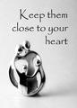
Keep them close to your heartby dsa157Comment: nice little 'thing". Although i'm not sure what it is, I'd guess its a kind of neckless of some kind. The Item feels dirty unfortunatly (inside) and is slightly out of focus. The Font used is interesting, but for some reason, i don't find it appealing; perharps because it feels as dirty as the item?! 6 |
 Photographer found comment helpful. Photographer found comment helpful. |
| 04/25/2005 01:54:51 PM |
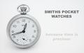
Smithsby justinbrookComment: Very nice composition. Lighting is simple but efficient. Its nice to see the white background is mastered, with no yellow burns around the shadows. The text is simple and catchy, but suffered because of the image compression (all the curves). Also the second part of the text is kind of odd, as its disapearing, making it harder to read. One suggestion would be to reshoot without hidding the "smiths" on the watch. That's the important part of the watch, which is partially hidden. GW. 8 |
| Photographer found comment helpful. |
| 04/25/2005 07:08:19 AM |
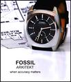
Arkitektby sbeaumontComment: Very cool idea! I like the text and slogan as well! The watch is in superb focus sharpness. Lighting is very good as well. I like the background detail as well, giving more 'power' to the watch, following the 'Accuracy' theme! Very nice. One thing that bugs me is the Reflection. It drags away the image and breaks the 'accuracy'. 8 |
| Photographer found comment helpful. |
| 04/25/2005 07:06:49 AM |
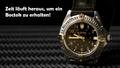
Zeit läuft ausby Art RoflmaoComment: interesting composition, would do good on a billboard. The picture could've used a slighty better focus, the sharpness is lacking a little. I find the 'black' background to be distracting as it doesn't split the image in a good way with the watch, taking away the bracelet. Also, there is this big reflection in the lens (goldish white) which doesn't help. Dig what the watch is resting on tho. 6 |
| Photographer found comment helpful. |
| 04/25/2005 07:04:06 AM |
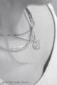
Untitledby troyloxComment: The idea is nice, unfortunatly the composition suffers greatly. Lower Left shows a bit of cloth which is bugging, especially since its so obvious with the text over it. The Focus is not sharp enough, not giving the jewel enought attention. Also the number of neckless is, although normal and 'natural', doesn't help the jewel to stand out. 5 |
| Photographer found comment helpful. |
| 04/25/2005 07:01:32 AM |
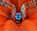
The Giftby GolferDDSComment: Very interesting composition. On the other hand, i find the colours way too strong, especially the orange/red of the flower, as it takes too much away from the jewel(Blue). Also the pic seems to be suffering from a little soft focusing. More sharpness would've been a good idea. The Text is almost non existant and hard to read. Writen on a black frame would've helped a lot. 6 |
| Photographer found comment helpful. |
| 04/08/2005 10:47:18 PM |
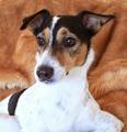
Poochieby naomikComment: Cute little bugger. Picture could've used some sharpening. Perharps its the focus that's off slightly? Lighting is somewhat dull and washed out on the white fur. Picture also need some more contrast. Composition is ok, but i would've wished for a little bit more body parts. 5 |
| Photographer found comment helpful. |
| 04/08/2005 10:45:54 PM |
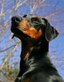
A Noble Companionby saiphfireComment: Nice DOF. Composition is very good, although i little off to the right. Lighting is nice, but i'd wish for a reflector below the dog's face (left). 6 |
| Photographer found comment helpful. |
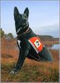
| 04/08/2005 10:44:38 PM |
Certified Assistance Dog "Karma"by Bear_MusicComment: Very nice and honorific composition. That beast knows what its doing! Colours are a little blend (background mostly) but doesn't drag away too much from the shot. Lighting could've been a little bit more dramatic (is this shoot 100% natural light?) Perharps a reflector could've helped some. Not sure i like the frame. It doesn't give the pic any "more". I believe the white is what throws me off. 6 |
| Photographer found comment helpful. |
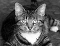
| 04/08/2005 10:42:37 PM |
Shyannby TikicharmComment: Interesting eyes this little one has. Lighting is good on the cat's face, but somewhat lacking on the rest of the body. The DOF works and makes me understand the lighting, but the composition really doesn't give the cat justice. I would've wished for a little bit more body parts. 5 |
| Photographer found comment helpful. |
Home -
Challenges -
Community -
League -
Photos -
Cameras -
Lenses -
Learn -
Help -
Terms of Use -
Privacy -
Top ^
DPChallenge, and website content and design, Copyright © 2001-2025 Challenging Technologies, LLC.
All digital photo copyrights belong to the photographers and may not be used without permission.
Current Server Time: 04/12/2025 05:24:51 AM EDT.