| Author | Thread |
Comments Made During the Challenge  |
|
|
05/01/2005 01:53:16 PM |
| Nice composition, at first I thought it was some kind of face though. |
|
 Photographer found comment helpful. Photographer found comment helpful. |
|
|
05/01/2005 08:50:26 AM |
|
| Photographer found comment helpful. |
|
|
05/01/2005 12:19:13 AM |
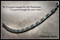
B & W works well here, and I like the offset comosition of this shot.
Your text / font is a style that seems to work with this, as it's not gawdy, nor too big.
Overall a pretty decent shot with one minor distraction: The black spots on the metal. (6)
|
|
| Photographer found comment helpful. |
|
|
04/29/2005 10:42:34 PM |
|
| Photographer found comment helpful. |
|
|
04/29/2005 12:29:55 PM |
| like the picture, not crazy about the text. |
|
| Photographer found comment helpful. |
|
|
04/29/2005 09:33:27 AM |
|
| Photographer found comment helpful. |
|
|
04/29/2005 04:53:31 AM |
| Nice composition and good lighting. The text is a perfect fit for the ad. |
|
| Photographer found comment helpful. |
|
|
04/29/2005 02:50:24 AM |
| Nice written words. I like the font you used. This looks good desaturated also. And I like the message it puts forth. 7 |
|
| Photographer found comment helpful. |
|
|
04/28/2005 10:40:15 PM |
| First imaige I've seen that kinda wants me to dig in my pocket, and I'm one cheap SOB. |
|
| Photographer found comment helpful. |
|
|
04/28/2005 06:06:15 AM |
| I like the composition and lighting. Good choice of text, works very well for this image. Would like to see this make top 20. Good luck. |
|
| Photographer found comment helpful. |
|
|
04/27/2005 05:38:05 PM |
| Had to study the object to figure out the title. Nice. Might be better if a bit lighter background and more light directly on the subject. |
|
| Photographer found comment helpful. |
|
|
04/27/2005 11:40:05 AM |
| A very nice presentation. My tiny complaint is with the blown parts of the subject. However, the overall look is pleasing with good use of background. Bumping up |
|
| Photographer found comment helpful. |
|
|
04/27/2005 04:54:53 AM |
| Lovely sculpure. Nicely photographed. Text is very tastefully handled. |
|
| Photographer found comment helpful. |
|
|
04/26/2005 02:52:35 PM |
| This is a nicely presented ad. Nice comp and font. However I don't get that this an ad for jewelry, maybe family values or religion. |
|
| Photographer found comment helpful. |
|
|
04/25/2005 01:56:29 PM |
| nice little 'thing". Although i'm not sure what it is, I'd guess its a kind of neckless of some kind. The Item feels dirty unfortunatly (inside) and is slightly out of focus. The Font used is interesting, but for some reason, i don't find it appealing; perharps because it feels as dirty as the item?! 6 |
|
| Photographer found comment helpful. |
|
|
04/25/2005 08:14:11 AM |
| I really like this photo. The image created touches the heart, good job! |
|
| Photographer found comment helpful. |
|
|
04/25/2005 02:45:28 AM |
| Nice - not quite sure what it is, but nice! Not a traditionsal jewellery shot - is this a brooch? |
|
| Photographer found comment helpful. |
|
|
04/24/2005 10:33:15 PM |
| nice..simple...elegant...emotional..i like...7 |
|
| Photographer found comment helpful. |
|
|
04/24/2005 10:21:20 PM |
| Cute, black section seem a tad strong. |
|
| Photographer found comment helpful. |
|
|
04/24/2005 10:13:21 PM |
| Awesome!!! Would make a great advert |
|
| Photographer found comment helpful. |
|
|
04/24/2005 08:42:39 PM |
|
| Photographer found comment helpful. |
Home -
Challenges -
Community -
League -
Photos -
Cameras -
Lenses -
Learn -
Help -
Terms of Use -
Privacy -
Top ^
DPChallenge, and website content and design, Copyright © 2001-2025 Challenging Technologies, LLC.
All digital photo copyrights belong to the photographers and may not be used without permission.
Current Server Time: 04/08/2025 01:37:04 AM EDT.