| Image |
Comment |
| 08/17/2004 12:46:29 PM |
|
 Photographer found comment helpful. Photographer found comment helpful. |
| 08/17/2004 12:45:30 PM |
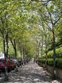
Canopyby sincereheComment: Nice dappled lighting, the figure adds interest and a sense of perspective. I think a slight change in viewpoint, to the left and a tighter crop to loose the parked cars would have made the image better. |
| 08/17/2004 12:43:38 PM |
ladder, window, doorby ellamayComment: If it was intentional to burn out the foreground and the other side of the tunnel then sorry but this does nothing for me. A nice idea but it needs detail to hold the interest of the viewer. |
| 08/17/2004 12:39:56 PM |
vanishing islandsby sirenaComment: I like the muted colours in this shot a nice overall tone. However the fundamental error is that the horizon is not level. Also having the horizon on or about the midddle of the shot does not usually work very well. Its generally better to have the horizon on the top or bottom third of the photograph, depending on what you what to emphasise, the sky, or the sea. |
| Photographer found comment helpful. |
| 08/17/2004 12:36:32 PM |
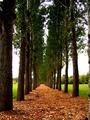
Into The Woodsby Hot KarlComment: Obvious idea but it works well enough. Slightly less central may have worked better? The colours are saturated well, almost to the point of being overdone. The tree down the left of the picture should have been cropped out. Close attention should be given to what is in the frame. |
| Photographer found comment helpful. |
| 08/17/2004 12:30:23 PM |
|
| Photographer found comment helpful. |
| 08/17/2004 12:27:07 PM |
By the Boardwalk...by dcclossComment: A nice try at the challange. Plenty of lead-ins, the edge of the grass, the gaurd rail, the decking etc. They all lead the eye into the picture, but there isn't really an object of interest to see there once the eye is drawn in. The child looking the other way is distracting, makes you want to see what she is looking at. The picture as a whole is a bit messy and cluttered. Try changing your view point with shots like this, keep the lead-ins as strong as possible but try to loose as much clutter as possible. |
| Photographer found comment helpful. |
| 08/17/2004 12:21:28 PM |
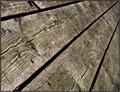
Wood you get to the point.by lytaComment: Nice idea, good exposure, nice detail in the grain of the wood. Nicely framed, the angle of the planks I mean. For me its a bit to tighly cropped, I would have liked to have seen further along the planks, more of the perspective effect. |
| Photographer found comment helpful. |
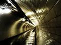
| 08/17/2004 12:14:13 PM |
200,000 Tilesby redmoonComment: A real quality image, some might say a bit obvious but very well presented non the less. The only flaw, if you can call it that, for me would be the very burnt out lights, but I don't know how that could be avoided without some manipulation. The viewpoint is excellent, the depth of field is spot on, the colour, the reflections combine to produce a very high quality image in my opinion. One I would be very proud of and very envious of as it happens. Well done! |
| Photographer found comment helpful. |
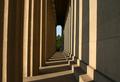
| 08/17/2004 12:06:28 PM |
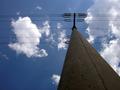
Athenas Hallwayby zmaerdComment: Nice lighting and texture. Assuming that's a figure in red at the end of the row of columns its a bit too small. Also I think a lower viewpoint and slightly offset from the center would have worked better. |
| Photographer found comment helpful. |
Home -
Challenges -
Community -
League -
Photos -
Cameras -
Lenses -
Learn -
Help -
Terms of Use -
Privacy -
Top ^
DPChallenge, and website content and design, Copyright © 2001-2025 Challenging Technologies, LLC.
All digital photo copyrights belong to the photographers and may not be used without permission.
Current Server Time: 04/07/2025 06:27:52 AM EDT.