| Image |
Comment |
| 10/06/2004 10:53:56 AM |
Parts of the worldby car1322Comment: Money is always interesting. Nice colours and detail. The white space down in the bottom right detracts and could easily have been avoided. |
| 10/06/2004 10:52:30 AM |
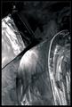
I Am Not Lostby jmsetzlerComment: I have no idea what this is a picture of, its some sort of manufactured metalic object? But I don't know what. I think that's what make it so appealing. That and the texture of the metal, the tones and the lighting. Oh yes and I think the black border enhances the image. |
| 10/06/2004 10:47:33 AM |
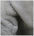
Pachyderm's Pinnaby flip89Comment: Another wonderful texture / detail shot. I think some sort of colour or tone might have improved it though. As long as that is within the rules of the challenge. |
 Photographer found comment helpful. Photographer found comment helpful. |
| 10/06/2004 10:44:59 AM |
Upon a Curvy Shoreby leteneleComment: Wonderfully light an airy feel to this shot. The whole thing looks so delicate. Amazing detail which fills the frame well. |
| Photographer found comment helpful. |
| 10/06/2004 10:43:10 AM |
Cracked...by agwrightComment: This is an excellent abstract shot, wonderful tones, you can almost reach out and feel the texture and the weight. Great observation, well captured. |
| Photographer found comment helpful. |
| 10/06/2004 10:41:12 AM |
From the parts we make music.by KiwiChrisComment: Interesting viewpoint, warm colours, good use of DOF. I can hear the music...wish I could play it. I can't help thinking that it may have been better with the point of focus one or two hammers further down the row? You didn't take some others with different POF did you? Especially with the one in focus in a different position, as if about the strike? Or am I getting carried away here? |
| 10/06/2004 10:35:57 AM |
Manual Transmissionby Kha0SComment: Fits the challenge perfectly. Hope you didn't take your gearbox appart to get this ;-) There seems to be a strange texture to the faces of the gear wheels etc. is that intentional? It looks ok makes it a bit different. The lighting is good, composition is good. In my opinion the overall greyness makes it seem a bit flat? Just the impression I get. |
| Photographer found comment helpful. |
| 10/06/2004 10:30:15 AM |
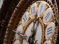
Clock in Museum d'Orsay in Parisby tonnyvComment: I nice crisp image, was this a large clock? The top left corner is a bit distracting. Apart from that nice colouring and lighting. I didn't tink it fits the challenge as well as some other entries. But it is a part of a clock. |
| 10/06/2004 10:27:59 AM |
Clock Partsby ladpupmoeComment: A good idea, nice colours but it kinds of lacks character in my opinion. Its a bit "sterile" if you see what I mean. Perhaps that how you wanted it? I would have scored it higher if it had more "character" (for want of a better word). Just my opinion though. |
| Photographer found comment helpful. |
| 10/06/2004 10:21:58 AM |
Out the barrel of a cannonby zeke123caComment: I like an image which can instantly convey an idea or conjure up a story, this does that for me. The colours are nice and even which works well here. The sky is a little burnt out but not too bad. Well done. I also like the paronraminc crop. |
| Photographer found comment helpful. |
Home -
Challenges -
Community -
League -
Photos -
Cameras -
Lenses -
Learn -
Help -
Terms of Use -
Privacy -
Top ^
DPChallenge, and website content and design, Copyright © 2001-2025 Challenging Technologies, LLC.
All digital photo copyrights belong to the photographers and may not be used without permission.
Current Server Time: 04/12/2025 08:11:41 PM EDT.