| Image |
Comment |
| 04/18/2005 03:47:09 PM |
|
 Photographer found comment helpful. Photographer found comment helpful. |
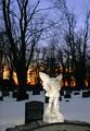
| 04/18/2005 03:46:43 PM |
Silent Sentryby datcatComment: Love the shot, the colors are great, awesome composition but your highlights are a bit too blown out. |
| Photographer found comment helpful. |
| 04/18/2005 03:45:50 PM |
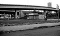
Faded Gloryby amsmythComment: I like the idea of what you've got here. Great buildings and what I imagine is a great background setup but I think the angle and crop hurt the overall composition. |
| Photographer found comment helpful. |
| 04/18/2005 03:44:26 PM |
|
| Photographer found comment helpful. |
| 03/31/2005 02:10:50 PM |
Reflexionsby timmotykaComment: pretty sweet. I'd someday like to get a grasp on this sort of shot. For now great job on the execution |
| Photographer found comment helpful. |
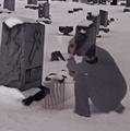
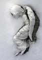
| 03/31/2005 02:09:00 PM |
Snow Angelby KaDiComment: Kind of creepy if you ask me. I would have enjoyed it more not seeing the grass on the right. good job. |
| Photographer found comment helpful. |
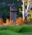
| 03/31/2005 02:08:15 PM |
Broken Angelby ShamanComment: I think something is missing with this shot. Perhaps diffusing your fill light would create a less obvious look. I do like the gold in the back. |
| Photographer found comment helpful. |
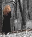
| 03/31/2005 02:06:34 PM |
Forgottenby dahkotaComment: I really thought I'd see more of this type of thing during this challenge, but since I havn't props to you! Great glow on the grass, like the soft nature of the entire shot. It looks as though you've masked her out of this layer. I like it |
| Photographer found comment helpful. |
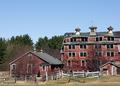
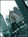
| 03/31/2005 02:04:57 PM |
la casa del vigilanteby lukewarmtapiocaComment: I like the tones in the 'front' of the shot, but the pink in the back seems really out of place. I'm also not a fan of this kind of slanted composition but to each their own. I would enjoy this alot more had it not been so (for lack of a better word) crooked, and perhaps done with a midnight blue and black duo-tone. |
| 03/31/2005 02:02:43 PM |
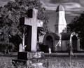
Old & Weatheredby HeavyComment: This comment is based on assumption alone. That said I'm not a fan of the shades you've chosen for your duo tone. I do, however, like that it's not the same ol' goldish gray so props for that. I also noticed that the focus is mostly on the church, displeasing to my personal tastes. I would have enjoyed it more had the focus been on the cross, with a more shallow DOF on the church and other bg elements. |
| Photographer found comment helpful. |
Home -
Challenges -
Community -
League -
Photos -
Cameras -
Lenses -
Learn -
Help -
Terms of Use -
Privacy -
Top ^
DPChallenge, and website content and design, Copyright © 2001-2025 Challenging Technologies, LLC.
All digital photo copyrights belong to the photographers and may not be used without permission.
Current Server Time: 04/13/2025 11:46:07 AM EDT.