| Image |
Comment |
| 08/12/2004 10:26:13 AM |
|
| 08/12/2004 10:22:24 AM |
|
| 08/12/2004 10:19:50 AM |
Falling by heidaComment: gorgeous blue background and amusing static/dynamic discrepancy; nice lighting on the skin |
 Photographer found comment helpful. Photographer found comment helpful. |
| 08/12/2004 10:18:32 AM |
all kindsby brunasComment: I don't see the foot theme connection - I dislike the top right light and the slight angle in the shelf - the way the light shines on the wood is nice but overall there is too much competition visually |
| 08/12/2004 10:12:51 AM |
Twinsby PedroComment: less would have been more for me - or else all feet more on the focal plane - a pity the two feet are cut - I do like the lighting though |
| Photographer found comment helpful. |
| 08/11/2004 02:47:16 PM |
|
| Photographer found comment helpful. |
| 08/11/2004 02:44:21 PM |
Feet and Inchesby ClubJuggleComment: the area of focus seems a bit random and not differentiated enough from the unfocused area - but then I always analyze everything ... |
| Photographer found comment helpful. |
| 08/11/2004 02:42:19 PM |
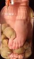
Pickled Feetby MatrixReloadedComment: cool idea and nicely weird colors - I would have liked the glass to be straight, not cut and to see more black background to offset the image |
| Photographer found comment helpful. |
| 08/11/2004 02:37:00 PM |
OK! My Turnby ladpupmoeComment: I find the white leg in the background too noticeable, nice shine on the jeans wearer's platform |
| Photographer found comment helpful. |
| 08/09/2004 09:52:57 AM |
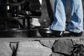
Tired, Hot, Dustyby newtune3Comment: boring: the lighting should be focusing on the shoes, or there should be shadows or the leather should have more gleaming depth - and the blurred grid of the tiles seems unnecessary |
| Photographer found comment helpful. |
Home -
Challenges -
Community -
League -
Photos -
Cameras -
Lenses -
Learn -
Help -
Terms of Use -
Privacy -
Top ^
DPChallenge, and website content and design, Copyright © 2001-2025 Challenging Technologies, LLC.
All digital photo copyrights belong to the photographers and may not be used without permission.
Current Server Time: 04/12/2025 09:10:50 AM EDT.