| Image |
Comment |
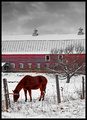
| 01/04/2007 06:30:53 PM |
Nature's Glowby bigfellaComment: Midtones are a little bit too dark here. Also? If this was a set-up shot? That hat looks too small for her head and the dress seems out of place with your more simplistic fence and glowing orange lighting. I'd try plain white, or anything without a pattern. That being said, this is a cute portrait for the album. Wonder how it would look in black and white. |
 Photographer found comment helpful. Photographer found comment helpful. |
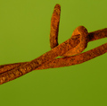
| 01/04/2007 06:27:33 PM |
Electric Fenceby cryanComment: Okay, the processing looks pretty cool, but I think you've taken the reds a bit too far to make a top placement in this challenge. |
| Photographer found comment helpful. |
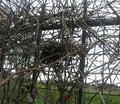
| 01/04/2007 06:25:21 PM |
Home Sweet Homeby imagineklpComment: This is neat, something unexpected in a fence challenge. The angle seems to be a bit too low, though. This would put the focus more on the tangle of sticks in the bird's nest, but I can totally see this image when taken from an angle near the nest and done in black and white. Probably wouldn't meet the challenge then, but might make a really neat print! |
| Photographer found comment helpful. |
| 01/04/2007 06:22:56 PM |
A Winter Sunsetby wali12Comment: Argh! I can barely see the sunset! Had to go looking for it. And the dunes seem really washed out, even if they were in shadow. I'd like to see more sky; perhaps the red of the sunset gilding the fence posts. This image certainly meets the challenge and has a lot of potential with a re-take. |
| Photographer found comment helpful. |
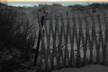
| 01/04/2007 06:20:38 PM |
Old Red Fenceby ivale28Comment: This could be so pretty! It's a good idea, unfortunately the angle you chose to compose with is hurting you here. I really like the far end of the fence in this image; it's the front section that's so distracting. Perhaps a different crop would help; perhaps it needs to be re-taken from another angle. |
| Photographer found comment helpful. |
| 01/04/2007 06:18:16 PM |
Rusty barbby Prime_TimeComment: Interesting combination of colors. I understand this to be part of a fence, but it doesn't strike me as enough of the fence. Does that make sense? Still, a 7. Good focus and nice texture. |
| Photographer found comment helpful. |
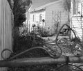
| 01/04/2007 06:16:33 PM |
Why Do I Always Get Left Behind?by Shy ClickerComment: Cute idea, and I think the black and white could add to the mood. However, the dog isn't large enough in this composition for me. I had to read the title and then look for the subject. Move in, remove the foreground and unneccesary side walls. |
| Photographer found comment helpful. |
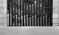
| 01/04/2007 06:14:46 PM |
Crafted Protectionby TiNComment: An interesting idea with nice colors. The distracting silhouettes in the background and the fact that your main point of interest isn't straight on with the camera detract from the image, though. |
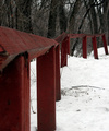
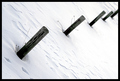
| 01/04/2007 06:12:50 PM |
Snow Postsby drewsephComment: I really like this, but feel the tilt is too extreme for me personally. |
| Photographer found comment helpful. |
| 01/04/2007 06:11:59 PM |
Multiple fencesby threekiddadComment: Your foreground fence is blurry; your rearground fence lacks punch. I understand your concept, but this seems poorly executed. |
| Photographer found comment helpful. |
Home -
Challenges -
Community -
League -
Photos -
Cameras -
Lenses -
Learn -
Help -
Terms of Use -
Privacy -
Top ^
DPChallenge, and website content and design, Copyright © 2001-2025 Challenging Technologies, LLC.
All digital photo copyrights belong to the photographers and may not be used without permission.
Current Server Time: 04/07/2025 06:20:03 AM EDT.