| Author | Thread |
Comments Made During the Challenge  |
|
|
01/09/2007 06:24:58 PM |
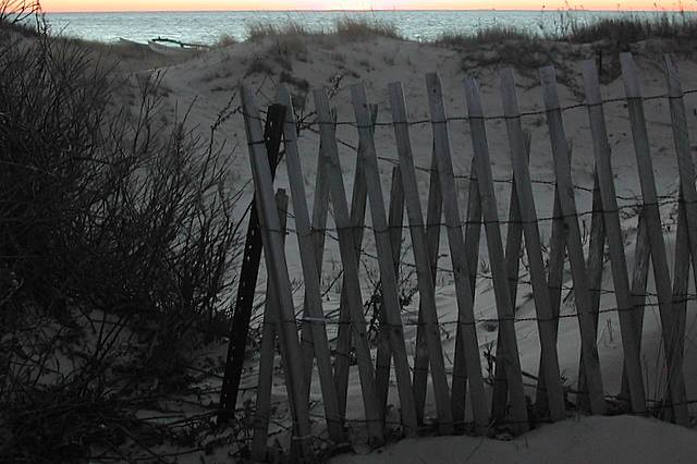
| the top of the image is distracting. either you need more of the sunset or none at all. |
|
 Photographer found comment helpful. Photographer found comment helpful. |
|
|
01/09/2007 11:34:42 AM |
| Nice idea - but having the strong colour at the top tends to drag my eye there, rather than to the interesting fence pattern. |
|
| Photographer found comment helpful. |
|
|
01/09/2007 08:20:11 AM |
|
| Photographer found comment helpful. |
|
|
01/09/2007 07:28:11 AM |
| The very thin line of sunset at the top of the picture is very distracting. I would have either included more or taken it out completely. |
|
| Photographer found comment helpful. |
|
|
01/09/2007 03:58:53 AM |
| IMO the horizon line looks odd so close to the top. |
|
| Photographer found comment helpful. |
|
|
01/08/2007 04:32:02 AM |
| I like the idea a lot! I would have liked to see more of the sky and the lower portion brightened up a bit. |
|
| Photographer found comment helpful. |
|
|
01/07/2007 01:48:04 PM |
|
| Photographer found comment helpful. |
|
|
01/04/2007 11:11:13 PM |
This has potential to be a good shot, but to me, it is lacking in a couple of basic fundamental areas. I know the rules of composition are nothing more than guidelines and can be broken. Give this link a quick look. It may be of help to you in positioning your horizon or at least give you some options to consider.
//www.colorpilot.com/comp_rules.html
In this case, I think I would have cropped the sky completely out, or included it only if it would fill at least the top 1/3 of the photo. Then maybe a couple tweaks of brightness and contrast. I hope this has been helpful to you. |
|
| Photographer found comment helpful. |
|
|
01/04/2007 06:22:56 PM |
| Argh! I can barely see the sunset! Had to go looking for it. And the dunes seem really washed out, even if they were in shadow. I'd like to see more sky; perhaps the red of the sunset gilding the fence posts. This image certainly meets the challenge and has a lot of potential with a re-take. |
|
| Photographer found comment helpful. |
|
|
01/04/2007 09:19:37 AM |
| I would like the crop to move up about 20% |
|
| Photographer found comment helpful. |
|
|
01/03/2007 10:26:34 AM |
| I really like this concept. I wonder if you could have included just a little bit more of the sky? To me the color of the ocean/sky in the background really compliments the bleak grey 'winter' of the sand and fence. |
|
| Photographer found comment helpful. |
|
|
01/03/2007 01:07:29 AM |
|
| Photographer found comment helpful. |
Home -
Challenges -
Community -
League -
Photos -
Cameras -
Lenses -
Learn -
Help -
Terms of Use -
Privacy -
Top ^
DPChallenge, and website content and design, Copyright © 2001-2025 Challenging Technologies, LLC.
All digital photo copyrights belong to the photographers and may not be used without permission.
Current Server Time: 04/07/2025 12:20:44 AM EDT.