| Image |
Comment |
| 07/22/2003 06:29:54 PM |
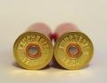
Illusion - Side to Sideby MusicmanComment: Ya gotta love guns! Ain't nothing better for shootin' stuff! The two cartriges alone don't offer much interest. I would suggest more dramatic lighting, more of an angle and possibly part of a shotgun in the background |
| 07/22/2003 06:27:34 PM |
Once was Roundby RgoldComment: I like the symmetry with the reflection, and the color is good too. But the crop is a little tight for my taste - especially for a shot like this. |
| 07/22/2003 06:19:05 PM |
"Trinity" at sunsetby dphillipsComment: I'm not really sure if I like the lighting because it emphasizes the sky more than the church. I think the composition could be better, too. I would suggest more of an angle or shoot it straight on to show the symmetry. There are some shots where forcing the rule of thirds doesn't work. |
| 07/22/2003 06:15:13 PM |
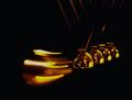
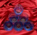
Round Momentumby JaxsonComment: I think if this was sharp and had some more light (especially on the wires and bottom of the balls) it would be great. I like the composition and movement. You had a good idea, but I don't think it was executed as well as it could have been. |
 Photographer found comment helpful. Photographer found comment helpful. |
| 07/22/2003 06:12:21 PM |
Soap on Metal with Suds #1by mciComment: The lighting and tones here are great. The subject really stands out. Composition is good and I especially like the texture added by the bubbles. |
| Photographer found comment helpful. |
| 07/22/2003 06:08:16 PM |
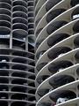
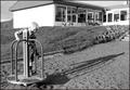
Parking Around.by KIKIComment: The lack of color here makes this shot a good candidate for black and white. That would also help increase the contrast and put more emphasis on the round shapes, which are nice. Composition is good. |
| Photographer found comment helpful. |
| 07/22/2003 06:05:41 PM |
Roundaboutby kengurinnComment: Composition is nice, but the background takes my attention from the kid. I like how the shadow extends diagonally toward the end of the frame. Good choice with the black and white. |
| 07/22/2003 06:03:30 PM |
Geometryby chickadeeComment: I think a little more contrast might help the subject stand out a little more. Interesting composition, but the image seems flat. I can see what you're going for with the background, but I think it's a little busy. |
| Photographer found comment helpful. |
| 07/22/2003 06:00:04 PM |
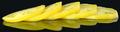
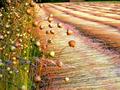
Fields of goldby RebTheRebelComment: Composition is excellent, however I think the [insert whatever plant that is here] in the middle of the frame should be in focus. |
| Photographer found comment helpful. |
| 07/22/2003 05:58:36 PM |
Political Centsby friscaComment: Nice job with the lighting. You did a good job of avoiding glare from the coins. |
| Photographer found comment helpful. |
Home -
Challenges -
Community -
League -
Photos -
Cameras -
Lenses -
Learn -
Help -
Terms of Use -
Privacy -
Top ^
DPChallenge, and website content and design, Copyright © 2001-2025 Challenging Technologies, LLC.
All digital photo copyrights belong to the photographers and may not be used without permission.
Current Server Time: 04/09/2025 12:46:33 PM EDT.