| Author | Thread |
Comments Made During the Challenge  |
|
|
07/22/2003 10:03:30 PM |
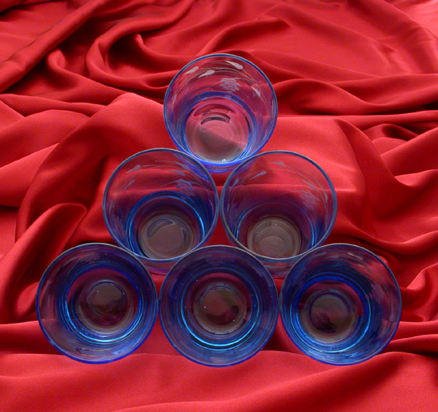
| I think a little more contrast might help the subject stand out a little more. Interesting composition, but the image seems flat. I can see what you're going for with the background, but I think it's a little busy. |
|
 Photographer found comment helpful. Photographer found comment helpful. |
|
|
07/21/2003 06:43:16 AM |
| try filling the glasses with water and other one with a small candel in each glass with that only for lighting. A good shot though!! |
|
| Photographer found comment helpful. |
|
|
07/19/2003 08:09:30 PM |
| Good effort, but the color's a bit muted. I'm assuming you were trying to keep reflections out of the glass. The angle feels a little odd - it leaves a lot of background at the top that keeps drawing my attention away from the glasses. A good idea that you might have been able to improve a little with some more work. |
|
| Photographer found comment helpful. |
|
|
07/19/2003 07:15:35 PM |
| Super lighting, nice billowing in the backdrop...just have a problem with the color, red might not have been the best choice.....hmmmm....yellow might have work for me. |
|
| Photographer found comment helpful. |
|
|
07/19/2003 03:10:43 PM |
| very nice. the only thing I would think to sudgest would be to use a yellow backdrop for the complementary colors, but very nice 8 |
|
| Photographer found comment helpful. |
|
|
07/18/2003 06:18:40 AM |
| Interesting, but I feel the background really detracts. A smooth red background would have highlited the subjects more. I do like the interaction between the glasses on the bottom and the fabric tho. |
|
| Photographer found comment helpful. |
|
|
07/17/2003 09:40:06 PM |
| The background is nice, everything is in focus and pleasant to look at. |
|
| Photographer found comment helpful. |
|
|
07/16/2003 04:04:33 PM |
|
|
|
07/16/2003 10:59:59 AM |
| Great background, shame about the glare on the glasses. The glasses also seem a little underexposed. 6 |
|
| Photographer found comment helpful. |
|
|
07/16/2003 01:37:30 AM |
| This is good, maybe a larger apeture to blur the background a little would put more emphasis on the subject. |
|
| Photographer found comment helpful. |
|
|
07/16/2003 12:37:31 AM |
| it's a trianlgle made out of round stuff. i'm confused. |
|
| Photographer found comment helpful. |
Home -
Challenges -
Community -
League -
Photos -
Cameras -
Lenses -
Learn -
Help -
Terms of Use -
Privacy -
Top ^
DPChallenge, and website content and design, Copyright © 2001-2026 Challenging Technologies, LLC.
All digital photo copyrights belong to the photographers and may not be used without permission.
Current Server Time: 02/01/2026 10:39:43 AM EST.