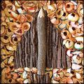
The "S"erpent Dragon by
actnoutComment: Hi Frank,
Normally here is where I say simply that my feelings are that every comment is helpful, you can draw lots of info from even the shortest of little comments. I'm going to expand a little on that, since we've gone and called out several commenters here publicly.
First of all, your opening statement of your OP, that may be your personal approach to commenting, but it is definitely not the same with everyone. It is the very nature of the site, you post photos, people study them and state their opinions in the form of comments, likes, dislikes, positive, negative, yes, intrepretation sometimes, constructive, advice, whatever. A lot of folks on the site have a goal of learning, improving their own photography. One thing that helps this along is such critiquing of images. To put it bluntly, if all one is after is glowing praise, this is not the place, best to stick to showing those photos to freinds and family, they will stroke the ego no matter what it is.
Now, in your closing statement, you do say that you are looking for self improvement. Well, then you are in the right place! :-) And these are the kind of comments that can help you along the way. It is up to you though, to sort through, and 'organize' and draw out the information that is there. Sure, it is a little work, and it would be nice if every comment was long, and had a little positive to sugar coat the negative, and all that, but hey, it's not a perfect world, and some people are short and direct, that's fine.
Let's take a look at these comments. Keep in mind, that this is an example, and based on what I see, and my opinions.
'Not lovin the comp.' - First off, I always think that every comment is probably 'representative' of more people that shared a similar thought and just didn't comment. This tells me a lot. Basically, the composition is weak to this group of people. Did I use any strong compositional tools? Leading lines, rule of thirds? etc. Is it static, centered? Is it exciting, dynamic? Does the subject stand out? Is it obvious what the subject is? Knowing that the commenter thinks that the comp is weak, I can look at it and think, is there something different/better I could of done to make it stronger?
'I don't like this one because the object in the back is so blurry that it doesn't appear that it should even be in the photo. Secondly, the object in the front looks to be a drawing. So if you take away the object in the front the photo would be a poor one. I might not get it though so sorry for my low score.'- Ok, this is a great comment! Very specific info here. It brings into question choices of focus, dof and even again, the composition. If my main subject is the dragon, than this tells me, that viewers are confused about that due to the way that I have presented the image. Maybe I've included elements that are not supportive of the concept of the image. This gives me lots of food for thought to look at and self critique my shot.
'Wondering where you took this. Through the window of a Chinese restaurant perhaps?'
'not sure i understand. are we looking through a decal on glass?'- these 2 pretty much say the same thing. They are both formed as questions. These people come out and say they are not getting it. So I can ask myself, did I succeed in conveying my idea? Obviously not to at least this group :-) Again, did I compose the shot well, to get the concept across? Do all my included elements work together well to drive the theme? Could I have done things differently? Do I want the viewer to be confused when looking? If not, then I need to work on how I present my image.
'not on topic'- so again, this group is not seeing the S curve. We know that the dragon does have an S curve, so, we have to look at it and think how well did we present that? Is it obvious, or does the viewer have to 'look' a little to see it? Should I have made the subject more prominent? Maybe a different pov or angle could make a difference? Maybe focus choice or dof? Maybe the horse on the glass is over powering and they just didn't notice the dragon? Maybe my choice of subject doesn't 'fit' as well as I thought it did? Or, maybe I just didn't present it strong enough?
'I wish the s-curve was a stronger element in the composition.'- Well, this kind of validates the previous group, right? :-) These folks see it, but think that the presentation could be stronger. Easy to see how the other group could possibly miss it all together. And again, it points in the direction of taking a look at how I chose to compose the shot.
So now you have all this info, and raised questions, and thoughts in your mind. So, you can look at it and say, well those are their opinions, but they're all wrong, I'm right, I'm a genius and I don't care if others can see it or not. Awesome, keep doing what you're doing, keep in mind that you're right, and you don't care and just carry on, no need to complain or call anyone out for it. Ignore the ignorant masses, and go show your stuff to mom and aunt margarette for the occasional ego stroking.
....or, you can gather the info, and use it as a starting basis to take a hard honest look at your own stuff. Consider the choices you make in your image, and think about what can you do differently. Remember that this particular photo is water under the bridge now, but can you apply some of these thoughts, and some of this info to the next shot? Want more specific info? Great, post the pic in a thread, and you have some basis for the questions you wish to ask. For example, instead of just "Why did this shot not score well?", you could ask "How could I have made this composition stronger?" or "The dragon doesn't seem to be prominent enough in this shot, how could I make him stand out more?"
Sorry for being so long-winded, and if I seem to be brutal. I know for me, if I really wish to improve, I need to be brutal and honest with myself, and I need to make it happen, no one is going to spoon feed me :-) With this site, and like everything in life, the benefits are there for the taking, but you definitely need to reach out and take what you want, and make use of those benefits.