| Image |
Comment |
| 09/07/2006 11:16:50 AM |
So aloneby Ragga2000Comment: I like the idea but honestly think i would like the shot better with out the person. |
 Photographer found comment helpful. Photographer found comment helpful. |
| 09/06/2006 11:21:35 AM |
Sensuousby RudyC310Comment: I like the idea and pose of the shot with very nice lighting. My only two complaints are the spot on the wall being too distracting and the space above dosen't really help the image. I would crop almost all the way to her feet thus, almost elminating the spot and also bringing your attention to the subject more easily. |
| 09/04/2006 04:33:55 PM |
I See Youby avtramsayComment: Sure you've heard it a ton but, this needs to be much bigger to see all the detail. 6, would probably be a seven or eight bigger. |
| 09/04/2006 04:31:23 PM |
|
| Photographer found comment helpful. |
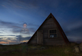
| 08/31/2006 10:23:53 AM |
Door to Windowby posthumousComment: I feel like this is laking a point of focus. It seems more like a shot of design and I like it in that sense. I do however wish it had more depth, as is it seems very flat. You've some hot spots but that dosen't really hurt the image. I know you can't control it, but i would prefer to not have the bence in the shot. Still though, this has a good design and shows an eye for composition. |
| Photographer found comment helpful. |
| 07/25/2006 08:24:31 PM |
|
| Photographer found comment helpful. |
| 07/25/2006 08:20:57 PM |
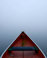
On the river Styxby kosmikkreeperComment: I really like the simplicity of this shot. It reminds me of a famous Sam Abell photograph. Something like this will do fantastic in the zen competition. |
| Photographer found comment helpful. |
| 07/12/2006 09:18:10 AM |
At a sea-side townby e301Comment: A well captured slice of ordinary life. Nice contrast and exposure as well. Bumping up 8 |
| Photographer found comment helpful. |
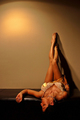
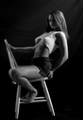
| 07/12/2006 09:15:48 AM |
Quite Passionby AkchasComment: Not a bad pose but I don't think that is the best chair to have her sitting on. I personally have had a hard time finding good chairs or props for models to sit on. Aside from that, I wish the main lght was on the left side to light up her face and body brighter instead of behind her. Her arm is so much brighter than everything else that it sort of demands attention when her face and and body should be more of the focus. I think that would also help give it a bump in contrast because as is, it is slightly flat. All that being said you are certainly on the right track and th young lady is definetly a 10. 7 |
| 07/12/2006 09:08:14 AM |
|
| Photographer found comment helpful. |
Home -
Challenges -
Community -
League -
Photos -
Cameras -
Lenses -
Learn -
Help -
Terms of Use -
Privacy -
Top ^
DPChallenge, and website content and design, Copyright © 2001-2025 Challenging Technologies, LLC.
All digital photo copyrights belong to the photographers and may not be used without permission.
Current Server Time: 04/07/2025 06:22:16 AM EDT.