| Image |
Comment |
| 03/30/2006 03:24:42 PM |
Pavilionby faidoiComment: Infrared. I'm kind of jealous. It's almost deceiving at first. It seems like a winter landscape with snow & ice. The architecture is very interesting and the textures in the image are great. The structure also kind of pops out at you. It stands out well from the background.
But on the down side I think they eye is left with nowhere to go because of the gazebo's central location. Maybe it would be more interesting to place it slightly off center.
As far as infrared images go I'm not the best person to provide a critique. I don't know that much. But it looks cool for sure.
Thanks for sharing the photo. |
 Photographer found comment helpful. Photographer found comment helpful. |
| 03/30/2006 03:16:58 PM |
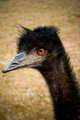
I am Emuby mattmacComment: Great hair... or feathers or something.
This is a funny shot because of it.
Having the background blurred out is great for keeping the attention on the subject. The eye has nice color that stands out and really provides a focal point for the viewer's eye. I like the vignetting as well. I don't know if the dark corners were intentional, but they help keep the viewer's focus in the center of the image. |
| Photographer found comment helpful. |
| 03/30/2006 03:10:11 PM |
There's Sunshine In Her Smileby RikkiComment: Unique photograph. Much better than a typical snapshot portrait.
GREAT perspective. The fingers provide wonderful lines for the viewer's eyes to follow to the subject's face. A less cluttered background would have faired better in the challenge, but I like the background personally because it gives a fun environment for the candid. Nice job. |
| Photographer found comment helpful. |
| 03/29/2006 10:43:44 AM |
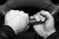
Driver's Seatby LouisComment: You didn't make any major mistakes with this image (focus, lack of tonal range, bad cropping) I think it just lacks any "pop." The hands are sharp and in focus. They show good detail and aren't blown out. That's all good. But they're posed in a strange way. It's a little confusing. It's unclear what you're trying to say with the image. I'm sure many voters said, "it's just hands holding a steering wheel in an awkward way."
So all this is in response to you asking why the image did not fare so well. Again you didn't make any major mistakes with the photograph, it's just a perplexing pose with slightly bland subject matter. |
| Photographer found comment helpful. |
| 03/29/2006 10:22:45 AM |
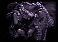
Picture 160octo1_filtereddpc.jpgby pawdrixComment: Very nice tones!
This is the most interesting (and best) image I've seen today.
Great job with the tones and the contrast. I'm a fan of the purple duotone you chose to use.
I love an image that brings such a strong sense of texture to the viewer. I'm sure many will say, "yuck!" and I think a strong reaction is a good reaction. The wet creature seems very palpable for a 2D image.
Thank you for showing me this, Steve.
(Are you 85?) |
| Photographer found comment helpful. |
| 03/29/2006 10:18:18 AM |
Solitudeby patrinusComment: The angle of the crop was a good idea. It makes the image very dramatic. It gives a sense of height and possible danger to the image.
Two other things that I like:
The lines of the rope bring my eye from the foreground directly to the subject.
The white shirt and hat on the man cause him to stand out from the rest of the image very nicely.
On the negative side for me, the man's face is totally featureless. That's frustrating as a viewer. However, this may have been your intent.
Nice job overall. |
| Photographer found comment helpful. |
| 03/29/2006 10:13:24 AM |
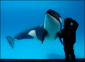
Eye To Eyeby rwouthuisComment: I really like it upon my first impression. Aquariums are not the easiest place to take photos due to the low light but you've done well. Exposing for the whale and leaving the child's silhouette was a nice choice. I really like the deep blue tones that give a sense of depth to the water. The fact that you captured the whale and child seemingly looking eye to eye is the best part. If I had to change one thing, I would crop off the black bar at the bottom of the imgage. Slightly distracting for me. Nice job.
Oh, and also, check out the similarities to this image of mine:

What are your thoughts? |
| Photographer found comment helpful. |
| 03/29/2006 10:09:11 AM |
Vineyardby tinky2Comment: First of all, nice use of the rule of thirds. You avoided placing the horizon in the center of the image. The cloudy sky is a good choice to fill 2/3 of the image. The colors are very nice. The yellow and blue compliment each other nicely. Also it's good that you have a foreground (post), midground (field), and background (mountains) subject. Not bad.
-Matthew |
| Photographer found comment helpful. |
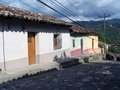
| 03/29/2006 10:04:53 AM |
Three Housesby cfischlComment: I really like the simple colors and true tones. Nothing is over-saturated (which I get tired of seeing). The angle of the shot causes my eye to wander down the street wondering what's just around the corner and what else there is to see. This is not a bad reaction, though. It leaves room for the viewer's imagination. The image also seems to capture the mood of the town. It has a sense of remoteness with the mountains in the background. Thanks for showing me this.
-Matthew |
| Photographer found comment helpful. |
| 03/29/2006 04:43:19 AM |
leafby brizmamaComment: Excellent macro, Erin. I love the tones and shallow dof. Nice job. |
| Photographer found comment helpful. |
Home -
Challenges -
Community -
League -
Photos -
Cameras -
Lenses -
Learn -
Help -
Terms of Use -
Privacy -
Top ^
DPChallenge, and website content and design, Copyright © 2001-2025 Challenging Technologies, LLC.
All digital photo copyrights belong to the photographers and may not be used without permission.
Current Server Time: 04/07/2025 06:20:13 AM EDT.