| Image |
Comment |
| 11/03/2005 10:59:30 AM |
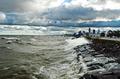
Runinng Down the Middleby moviemanComment: David,
Nice black & white! I think in this case, black & white was a good choice with the high contrast. Those two elements bring out the motion going on in this photograph.
Having said that, there are some obvious areas for improvement that I can see, one of which is that the contrast is so high, almost all of the whites are completely blown out, draining detail from even the runner in who is in focus, and while I think you've done a sufficient job of drawing the eye to the guy with the ball, there is quite a bit going on. Generally, sports shots contain fewer players so that there is no confusion as to what the focal point should be. I do like the composition, but it is a bit confusing.
Nice job, though. I think a little more detail would help the score.
-- Critique Club |
 Photographer found comment helpful. Photographer found comment helpful. |
| 11/01/2005 07:35:11 PM |
ring aroundby ursulaComment: This is absolutely, insanely beautiful. This is magnificent work. Kudos for the creativity and originality.
Astonishing to me... |
| Photographer found comment helpful. |
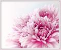
| 10/27/2005 09:33:52 PM |
Pinkby pearlseyesComment: I like that your picture is "Light on White" and not just "White on White" like many others in this competition. 8
I despise the border, but the image is wonderful. |
| Photographer found comment helpful. |
| 10/26/2005 04:59:18 PM |
Hmm...by sprite777Comment: Originally posted by rjkstesch:
Congratulations on your top 5 placement from all of us who usually look and fail to comment. It's a great image. |
Thanks! :) Also, I like your reflections without mirrors entry. I remember liking that one as I skimmed through. |
| 10/26/2005 04:24:08 PM |
|
| 10/25/2005 10:26:40 PM |
|
| Photographer found comment helpful. |
| 10/25/2005 10:06:39 PM |
Hmm...by sprite777Comment: How exciting! Message edited by author 2005-10-28 00:49:16. |
| 10/23/2005 11:18:05 AM |
|
| Photographer found comment helpful. |
| 10/09/2005 10:08:01 PM |
|
| Photographer found comment helpful. |
| 10/03/2005 04:28:49 PM |
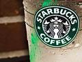
uncaffienated trendby totaldisComment: This would probably be better if you used the word "decaffeinated" (as "uncaffeinated" is not a word) and if you had taken the silly green straw out.
I like the dew. This has very good presence, although I find it hard to believe that the brick and the drink's shadow are really the way you photographed them. It almost looks superimposed... Anyway, this has very good clarity, which might just be the number 1 thing I look for in a photograph, so how about a 7? :) |
| Photographer found comment helpful. |
Home -
Challenges -
Community -
League -
Photos -
Cameras -
Lenses -
Learn -
Help -
Terms of Use -
Privacy -
Top ^
DPChallenge, and website content and design, Copyright © 2001-2025 Challenging Technologies, LLC.
All digital photo copyrights belong to the photographers and may not be used without permission.
Current Server Time: 04/13/2025 04:52:58 AM EDT.