| Image |
Comment |
| 06/20/2004 09:49:27 PM |
On Dutyby pmichaudComment: I think too much is saturated. Defeats the point of desaturating the background if too much is the main subject. Like the arms and skin usually may not be of great importance, while the kilt is very interesting. |
 Photographer found comment helpful. Photographer found comment helpful. |
| 06/20/2004 09:44:33 PM |
|
| Photographer found comment helpful. |
| 06/20/2004 09:43:27 PM |
Eyes to the Skyby ClickyChickyComment: blurry, better if it were sharper. And the eye color looks fake. It's supposed to be a desaturation contest, not a replace color. |
| Photographer found comment helpful. |
| 06/20/2004 09:41:07 PM |
|
| Photographer found comment helpful. |
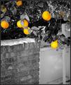
| 06/20/2004 09:40:36 PM |
Summer Lemonsby lizzyc3Comment: The edges are too sharp, looks fake. And saturation is too high, tone it down a bit. Use a smoother brush next time to get a gradient soft edge effect. |
| Photographer found comment helpful. |
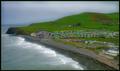
| 05/10/2004 03:18:15 PM |
Albany from across the Hudson Riverby Dave GordonComment: I'm sure the sky is often times like this over there, but it would really be a much better photo had there been some clouds or even dark rain clouds giving it an ominious look. But good overall composition. |
| Photographer found comment helpful. |
| 05/10/2004 03:15:33 PM |
heaven's forward progressionby xburnerxComment: I think too much post processing was done on this photo. Everything looks plastic like and the colors are fake. Use saturation wisely and if neat image was used, use that lightly also. |
| 05/10/2004 03:01:25 PM |
New Horizonsby silverleafComment: Nice colors and design, but the center of the flower should've been in focus and not the sides. And with advanced editing, the speck of black should've been removed, it is distracting. |
| Photographer found comment helpful. |
| 05/10/2004 03:00:44 PM |
Underwaterby GeneralEComment: I don't get it. There's nothing in focus to draw the attention of the viewer. |
| Photographer found comment helpful. |
| 05/10/2004 03:00:12 PM |
|
| Photographer found comment helpful. |
Home -
Challenges -
Community -
League -
Photos -
Cameras -
Lenses -
Learn -
Help -
Terms of Use -
Privacy -
Top ^
DPChallenge, and website content and design, Copyright © 2001-2025 Challenging Technologies, LLC.
All digital photo copyrights belong to the photographers and may not be used without permission.
Current Server Time: 04/11/2025 04:45:08 PM EDT.