| Image |
Comment |
| 06/18/2005 04:10:44 PM |
Headed Homeby GeneralEComment: The model is too centered... and the weeds almost overtake the boy in terms of importance in the scene. |
 Photographer found comment helpful. Photographer found comment helpful. |
| 06/18/2005 04:10:09 PM |
candle lightby babymaderoComment: The difference in color between the light of the flame on the candle and the light on the face is bothering me a bit, and I'm not sure about the position of the light in relation to the face. Maybe a different composition with the light in front of the face (so the flame overlaps the face) might have been stronger? |
| 06/18/2005 04:08:29 PM |
Light in the Darknessby ckempfComment: It does not seem to be in focus. The highly centered position of the candle looks out of place in relation to only the top half having any thing. |
| 06/18/2005 04:07:40 PM |
|
| Photographer found comment helpful. |
| 06/18/2005 04:07:09 PM |
cry Wolfby jmritzComment: The high contrasting white dots on the left side are very annoying, but without spot editting it might be hard to remove without washing out the fox (dog?). I'm not sure I like the crop however, pushing the fox so far to the right and cutting off the neck. |
| Photographer found comment helpful. |
| 06/18/2005 04:04:09 PM |
Checkmate; Darkness for the Kingby fd3rdComment: Maybe pushing it a bit... maybe if the winning side were to use black pieces (rather than a brownish finish) it might do better? I don't think the very centered composition is strong in showing the "darkness" of the loss. |
| Photographer found comment helpful. |
| 06/18/2005 04:02:04 PM |
The darkness of my mindby mariaksteinssonComment: Although I like the light on the upper half, the slight bit of light at the bottom where the leg is doesn't look right considering the almost completely black middle half. Perhaps full use of the 640 pixels would have helped in terms of detail, because a lot is lost with the smaller size. As for the model's expression, it doesn't look "dark", but it probably is just the lack of detail from the small resolution. |
| 06/18/2005 03:58:34 PM |
Pennyby sevensecondsComment: Perhaps a bit too much post processing? Large sections of the picture are washed out in the lime green and don't actually add to the picture. |
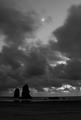
| 06/18/2005 03:57:28 PM |
Belle Lunaby ZoomdakComment: Ok... I recognize the area this is shot in... and I love the area. However here, it was shot at night, so you had to slow down the shutter but in doing so you ended up letting the clouds blur from movement yet the moon and rocks are in sharp focus. Perhaps you wanted this, but I'm not sure if this conflict is ideal. |
| Photographer found comment helpful. |
| 06/18/2005 03:54:19 PM |
Nearing Darkby pirate_mafiaComment: As a sunset picture, this is not very "wow". Perhaps you could have waited a bit longer so that the sun has neared the ground and caused some backlighting? In that case, it might confuse fewer people wondering about the "darkness" aspect. Also, using the full 640 pixels would be ideal. |
Home -
Challenges -
Community -
League -
Photos -
Cameras -
Lenses -
Learn -
Help -
Terms of Use -
Privacy -
Top ^
DPChallenge, and website content and design, Copyright © 2001-2025 Challenging Technologies, LLC.
All digital photo copyrights belong to the photographers and may not be used without permission.
Current Server Time: 04/09/2025 07:59:55 AM EDT.