| Image |
Comment |
| 02/03/2004 08:39:31 PM |
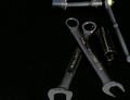
Garage Essentialsby PDavisComment: I feel the cropping in this image is too tight. space around the tools would be effective, or perhaps the opposite, more extreme cropping, but just snipping cropping is rarely effective. Perhaps a little dark. The image also seems very weighted to the right side. There isnothing leading or contrasting the empty space on the left. If even one wrench was stretching over there a bit more it would help. |
 Photographer found comment helpful. Photographer found comment helpful. |
| 02/03/2004 07:09:13 PM |
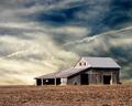
" I don't have a garage"by ellamayComment: welllll.............. garage..................... i got a BAD rating on my last challenge for not following the directions close enough..... but... well.... i laughed outloud... this was a great funny image. perhaps you could crop a little of the right. saturation, color, and contrast look good.... funny funny.... i'll give you a 9 .. |
| Photographer found comment helpful. |
| 02/03/2004 04:48:26 PM |
|
| Photographer found comment helpful. |
| 02/01/2004 08:51:36 PM |
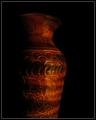
Painted Vaseby cshepComment: i gave it a 5.. which i feel is sort of an average vote. The black background was a good choice, but it didn't really stir up any emotions or thoughts inside of me. I am not sure what i would have done differently.. or how i would have painted it different... but it looked like a vase with light flashed on it... as apposed to a picture that created thought, or intrigue or reflection, or just a nice combination of shapes and colors...
maybe (not saying that i know).. but maybe if you had higlighted the rim quite bright... then left the neck quite dark... and then highlighted the pattern area on the widest part, then let it get slowly darker as it went lower. With the painting with light theme you could illuminate this object quite creativly. Right now it is illuminated in the same stile as if there was a single light source from the frong right..... just some thoughts... take them with a grain of salt. |
| 02/01/2004 08:19:51 PM |
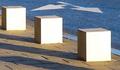
Cubes and arrowsby mannjuditComment: hi from the critique club
i really like the design element of this shot. It has very simple pleasing shapes, nice colors and a smooth flow. The seems a little light, perhaps just half a stop, but other than that well exposed. The space between the last block and the edge of the frame seems cramped. I wonder if it would look better if it was comparable to the size of the first space, or even half as large. I really like the arrow in the top of the picture, but it would be fun to try playing with different vantage points to put the arrow in a different spot in the image.. perhaps more to the right and lower.. however perhaps this well appear too contrived. Great elements in this photo. keep up the good work. |
| Photographer found comment helpful. |
| 01/29/2004 08:53:04 PM |
The Horseby Harz_JoergComment: critique club comment ....
I think you have a quite strong image, with the dark deep background and engergy filled subject. I think you chose a good background color. The cropping on this image is VERY tight, and much too tight actually on the bottom and perhaps on the right. The bottom white line is 1 pixel away from the bottom of the statue... which creates an akward line, and problem in the photo. It stops the eye at an unattractive, or uninteresting spot, it also leads the eye to the edge of the photo and leaves it there stranded. As you said, there is some white blasting in the image, and I agree. The could be softenend with a softer light sorce, or less direct light. Perhaps if you bounced the light off the wall before letting it hit the statue. i think the horiztonal (left right) angle is fine, and reasonably interesting, but perhaps you could play with the verticle. Try taking the picture from a lower or higher vantage point.
hope this helped. |
| Photographer found comment helpful. |
| 01/28/2004 06:34:53 PM |
the twins? (Gemini)by Jamie2772Comment: the subjects are very blurry and framing is too tight in my opinion. The colors are weak, with very little depth. |
| Photographer found comment helpful. |
| 01/28/2004 06:33:33 PM |
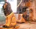
Don't let your luck go awayby FlipperComment: the light on the left is overpowering, and th light around the lionis also rather distracting. The lion seems overexposes. i think this shot could have been quite interesting with the background it has, but perhaps taken at a different angle. |
| Photographer found comment helpful. |
| 01/28/2004 06:32:22 PM |
|
| Photographer found comment helpful. |
| 01/28/2004 06:31:18 PM |
Leo the Regalby Glen KingComment: the image is blurry and doesn't really provoke an interest for me. The slant and lines in the sheet the cat is sitting on doesn't work very well as it pushes me off the picture. the whites are a little blasted out on the cat. |
| Photographer found comment helpful. |
Home -
Challenges -
Community -
League -
Photos -
Cameras -
Lenses -
Learn -
Help -
Terms of Use -
Privacy -
Top ^
DPChallenge, and website content and design, Copyright © 2001-2025 Challenging Technologies, LLC.
All digital photo copyrights belong to the photographers and may not be used without permission.
Current Server Time: 04/12/2025 10:55:17 AM EDT.