| Author | Thread |
Comments Made During the Challenge  |
|
|
02/07/2004 02:01:50 PM |
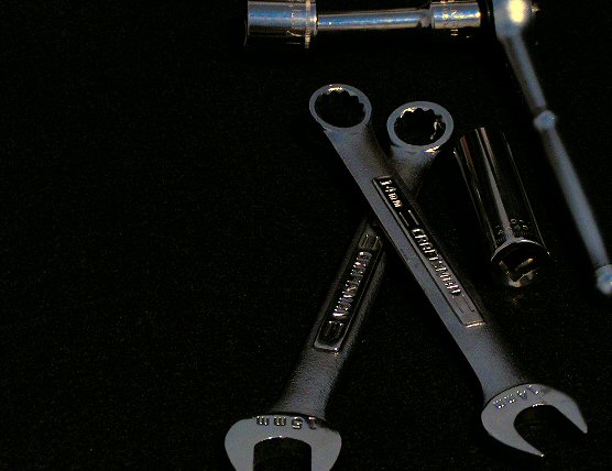
| There's too much black space on the left. More would have been effective as negative space and less would have made the composition feel more balanced, I think. |
|
 Photographer found comment helpful. Photographer found comment helpful. |
|
|
02/07/2004 12:28:11 AM |
| Nice composition, I feel that another source of light could improve the shot. |
|
| Photographer found comment helpful. |
|
|
02/06/2004 05:30:12 PM |
| a cropping disaster and a poor choice of background. |
|
|
|
02/05/2004 03:46:33 PM |
| cuttuing off all the parts seems unnecessary, considering the huge amount of negative space you have on the left (or could have stepped back/zoomed out slightly). |
|
| Photographer found comment helpful. |
|
|
02/05/2004 07:22:48 AM |
|
| Photographer found comment helpful. |
|
|
02/04/2004 01:51:26 PM |
| I like the black background, but the composition is lacking somewhat. Getting the upper right tool piece in clear focus may have helped. |
|
| Photographer found comment helpful. |
|
|
02/04/2004 12:44:36 PM |
| Too dark. Needs some pizazz with your lighting. |
|
| Photographer found comment helpful. |
|
|
02/04/2004 01:39:31 AM |
| I feel the cropping in this image is too tight. space around the tools would be effective, or perhaps the opposite, more extreme cropping, but just snipping cropping is rarely effective. Perhaps a little dark. The image also seems very weighted to the right side. There isnothing leading or contrasting the empty space on the left. If even one wrench was stretching over there a bit more it would help. |
|
| Photographer found comment helpful. |
Home -
Challenges -
Community -
League -
Photos -
Cameras -
Lenses -
Learn -
Help -
Terms of Use -
Privacy -
Top ^
DPChallenge, and website content and design, Copyright © 2001-2026 Challenging Technologies, LLC.
All digital photo copyrights belong to the photographers and may not be used without permission.
Current Server Time: 02/01/2026 11:59:14 AM EST.