|
|
|
Showing 141 - 150 of ~979 |
| Image |
Comment |
| 08/30/2006 11:32:58 PM | my momma always said...by taseComment: okay, first off i really hated this film; i'd rather have teeth extracted without anaesthetic than suffer it a second time. HOWever, you have taken a picture that is readily identifiable and is really in keeping with the style of the film. so it's bang on in respect of fitting the challenge. it's also been subtletly and very well editted to enhance it's filmic qualities in terms of colour and shading. it's also stirring of emotion (i currently have an overwhelming desire to punch the bugger) so it deserves a great solid 8. |
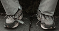
| 08/30/2006 11:18:59 PM | Batman Beginsby k_n_rajaComment: i would guess that it's an action figure, but it's not really that noticeably obvoius so kudos to you for an effective capture. the silhouette is very batman, and the colours are in keeping with the style of and artwork accompanying the film. dirty sensor splodges lessen the slickness of the picture, unfortunately, as does the level of noise / grain in the sky. otherwise, really nice! 7. |  Photographer found comment helpful. Photographer found comment helpful. |
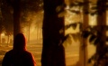
| 08/30/2006 11:15:09 PM | THE VILLAGEby kwaniComment: you've captured the spirit and style of the film precisely! the colours are perfect, and it is a glorious looking image; the soft focus working really effectively here. big fat 10. | | Photographer found comment helpful. |
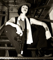
| 08/30/2006 11:00:25 PM | Pulp Fictionby lentilComment: not really a scene from the film, nor is it really of the same genre... surely some other B&W movie from depression / elliot ness era USA might be more suitable?? as a photo, the lighting and the whites feel a little bright and overpowering. the setting is very appropriate, as is the pose and attitude. 5. | | Photographer found comment helpful. |
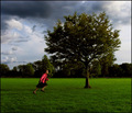
| 08/30/2006 03:27:17 AM | always thereby sigrun_thComment: i can see why this didn't do great in the challenge (too much movable life in the frame, I suppose) but i don't agree with the excessively low score of 4.1... this is a very dramatic, dynamic composition, and the post processing is very stylishly done, and feels natural. i think the lighting on the statue is really cool, and you wonder that if it were cropped above the demonstrators heads to form a 640 wide panoramic shot, it might have faired a lot better. i'd have given it a 7 - based on photographic merits, having already knocked off 3 for the not meeting challenge issues. |
| 08/29/2006 11:38:38 PM | Don`t Look Nowby Paul_MorganComment: never actually saw the film (too scared!) but i thought the coat was more red than pink, and a bit longer. anyway, that minr quibble aside, i think this is a very lovely image, with rich beautiful colours, great composition and a fair bit of foreboding ominence to it which is fitting given the film it's emulating. to me though, it doesn't feel all that cinematic, rather a piece of photographic art... 8. |
| 08/29/2006 11:34:42 PM | Psycho - Shower Sceneby MarioPierreComment: wow - the resemblence to janet leigh is extraordinary (much more convincing the anne heche!) one of the most famous scenes in film history, this homage has been excellently captured and has the feel of horror convincingly running though it. 10. | | Photographer found comment helpful. |
| 08/29/2006 11:31:40 PM | Parineeta---- Aparted from the Loveby vpratapComment: this is superb; the post processing is excellent and makes is feel very much like an actual still from a movie! i have not seen this film, i admit, but it does have a very much an authenitc asain / bollywoody feel about it. he looks like he might even break into song! you're models are excellent, and this is a fantastic image - 10. |
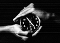
| 08/25/2006 10:32:34 AM | Essence of Timeby bharathmcComment: stylistically, i really do like this; as a thumbnail amongst all the others it really grabbed my attention. seeing that the actual image isn't that much bigger than the thumbnail was, must confess, a bit disappointing. it's also not big enough to determine whether or not the focus is actually soft. i think there's a tutorial for resizing; it's worth having a quick read. like i said though, conceptually, i love it. the B&W works well with the static type effect. lighting seems pretty well done. i also love the detail of the symmetry, in that at 4.55 it would be almost the same photo upside down. great thoughtful stuff - 8. | | Photographer found comment helpful. |
| 08/25/2006 10:26:46 AM | Soft Touchby LokiComment: a very pretty girl, but dress sense is erring a bit on the glamour-esque / page 3 sort of thing. the heels and knickers kind of limits the level of elegant subtlety a little bit; but that's just preference. it's really a picture of two halves; i tried cropping her from just below her hair and upwards, and really, i felt it would make (composition wise) a bloody gorgeous prtrait. true, you'd lose the tatoo which is a nice touch of personality, but her face ,skin, arms and hair is really brought out by the sepia and the black background, and her pose really suits the rule of thirds you've followed more... the softness is well achieved; it's there but not overly done to be obvious. 7. | | Photographer found comment helpful. |
|
Showing 141 - 150 of ~979 |
Home -
Challenges -
Community -
League -
Photos -
Cameras -
Lenses -
Learn -
Help -
Terms of Use -
Privacy -
Top ^
DPChallenge, and website content and design, Copyright © 2001-2025 Challenging Technologies, LLC.
All digital photo copyrights belong to the photographers and may not be used without permission.
Current Server Time: 04/12/2025 05:38:43 PM EDT.
|