|
|
|
Showing 111 - 120 of ~979 |
| Image |
Comment |
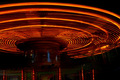
| 09/03/2006 11:43:10 PM | Merry-Go-Roundby benhurComment: this, i feel, would have been far more effective without the bottom portion of the ride. this bit is crooked, poorly lit, exposed and defined, and frankly looks wrong. the top half, by contrast, is a great example of light in abstract, and i wish you cropped everything below it out. seriously, by cropping at the midway point of the eclipse, you could have had a great piece of visual art; even turning it upside down to make it super obscure! overall though, 4. |  Photographer found comment helpful. Photographer found comment helpful. |
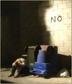
| 09/03/2006 11:37:55 PM | The Answerby Rae-AnnComment: given the title, this photo raises an unusally high number of questions. like; why are the wheelie bins upside down? it has an indecipherable narrative which i find quite appealing (like an episode of Lost, i suppose) and as a set up it's creative, though i think bordering on the pretentious. which isn't a bad thing, obviously. the soft (diffused?) glow is a bit overdone for my own tastes, and the brightness of the white portion of wall feels harsh. we see that the person is in despair, but oddly, possibly due to posture, the person has no defineable characteristics or personality (or indeed, apart from the sandals, gender), so it's difficult to feel any level empathy, emotion or sympathy for them, which leaves the picture feeling a bit cold overall. i like the concept, but to me it just misses something. 7. | | Photographer found comment helpful. |
| 09/03/2006 11:30:18 PM | Who?by fotodudeComment: very cute and lovely picture. i personally the focus is perhaps just a tad on the soft side for this sort of character; it also gives the eyes a weird sort of glow. i love the composition though, with him peeking out through the leaves. the dark background also works here. i was going to give it seven, but you get a bonus point for the snappy cute title :) 8. | | Photographer found comment helpful. |
| 09/03/2006 11:24:04 PM | Care for a shave?by wavelengthComment: this is so my sort of thing - fantastic stuff, really. i'm also thrilled that you resisted the what must have been big temptation to do the derelict = black and white equation; the colours here are stunning and the wall in terms of texture and colour makes for a superb background. i like the delicate burning around the edge (done subtly enough to look it was only naturally enhanced). the level of noise or the possible result of oversharpening on the chair is one minor complaint - especially with the arm on the left, and i kind of wish that the bits of weeds weren't there. but i guess that was mostly unavoidable. 9/10 | | Photographer found comment helpful. |
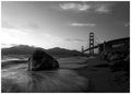
| 09/03/2006 11:10:44 PM | S E N T I N E Lby NaldComment: first reaction was a very immediate "wow". this certainly has something grand about it, and not just in terms of the scale. i love how the golden gate is just scenery here; i don't think i've ever seen it taken from this sort of angle before, and frankly, it's beauty and majesty is massively enhanced because you see clearly how it just fits within its environment. the long exposure adds another dimension (dark filter??) with the water being very visually pleasing. the only shame is that the sky is so overblown over the hills on the left, but it isn't that obtrusive a distraction... very lovely scenery; and especially warm because you also feel a personal love of the location from you the photographer. 9. | | Photographer found comment helpful. |
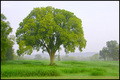
| 09/03/2006 10:50:36 PM | Green Acresby RockBruiseComment: one of those rare occassions where a blown out / white white sky actually enhances a picture and it's main subject. this is a lovely landscape shot, and is rich in feeling; you can imagine your shoes getting wet from the wet grass, and you can feel the chilly air... i also adore how the hills role into nothing through the mists... minor quibbles include the bright green tree encroaching the frame on the left (for composition i'd rather see our main tree a bit more isolated really) and the greens feel a smidgeon bit too unreal and bright, and could do with toning down or darkening. very lovely otherwise - 8. | | Photographer found comment helpful. |
| 09/03/2006 10:45:15 PM | these are the daysby mimsydotesComment: i like a lot about this; the colours, very much in the vein of coloured up black and white photos, are very nice and inviting. the pose, though obvoiusly posed, feels natural and, er, not posed. it feels joyous and happy. the car is also very photogenic, and fits in nicely. the noise reduction and or diffuse glow though feels excessive - in fact, i think a bit of grain would have a pleasant effect here... still, a nice portrait; and i like / appreciate the tongue in cheekness of the title. 7. |
| 09/03/2006 10:40:40 PM | Reach for the Woodby lucienawComment: personally i'm not really sure outtakes from other challenges makes for the best free study entry, especially when it is so instantly recognisable and doesn't show anything different. conceptually, i do think it's great, and if it wasn't so early at the time of writing and i had my coffee, no doubt i would see something deeply philisophical here. it would have had a bit more of a surreal impact if the stand wasn't there, though. i do like this; the tones and lighting is unfaultable, composition simple but effective, and having a sky as background instead of a black sheet nicely refreshing. it's really cool, but methinks your obvious high level of creativity should have made you do something new. 7. | | Photographer found comment helpful. |
| 09/03/2006 10:34:00 PM | Beauty Becomes A Sunsetby LERtasticComment: this is pretty, but there have been so many sunset pictures here with more dramatic skies, this one doesn't really stand out. also, the colour distortion around the Sun is a major distraction. the fence posts and wire do add another dimension, and their inclusion is definitely a plus. generally nicely composed, though feels there might be too much sky (especially the blue bits). making the skies darker (either burn tool or selecting the sky and using contrast or levels) might have upped the drama a bit. 5. | | Photographer found comment helpful. |
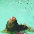
| 09/03/2006 10:28:43 PM | A study in H2O 2by DragonphenxComment: the most wow thing about this picture is the stunning colour of the water, and then it's the action that hits you. i love how obscurely alive this picture feels... the slightly washed out colours also suggest a particular period of time (sixties / seventies) and this in turn gives it extra character. my only slight wish was the the purple red swimsuit wasn't so purple and red; but aside from that this is a really captivating, enjoyable and intense image. 9. |
|
Showing 111 - 120 of ~979 |
Home -
Challenges -
Community -
League -
Photos -
Cameras -
Lenses -
Learn -
Help -
Terms of Use -
Privacy -
Top ^
DPChallenge, and website content and design, Copyright © 2001-2025 Challenging Technologies, LLC.
All digital photo copyrights belong to the photographers and may not be used without permission.
Current Server Time: 04/12/2025 12:10:28 PM EDT.
|