|
|
| Image |
Comment |
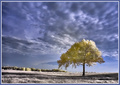
| 09/04/2006 01:36:36 PM | Lonelyby ShaneBlakeComment: so, this is the day you would be kicking yourself, what with the single tree challenge having just kicked off? tree position is also perfect, and good for the rule of thirds challenge... it's another lovely ir shot, though the tree is surprisingly yellow which kind of reduces the "wow, infrared rocks!" that normally hits me. it's almost like a giant cat peed on it. the big shadow is also a distrcation; i'm sitting wandering what cast such a large shadow (possibly the giant cat again...). the sky is really lovely, and the environment is beautiful. overall, very likeable, but i can't quite feel comfy about the yellows.. 7. |  Photographer found comment helpful. Photographer found comment helpful. |
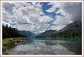
| 09/04/2006 01:31:14 PM | My Blissby ShecoyaComment: a beautiful, if conventional, landscape shot... it's actually odd in that given the mountainness environment, the moutains don't feel particularly awe inspiring. i think it lacks a sense of scale, and i'm not sure why. perhaps there is too much in the frame, or maybe it's the massive fluffy clouds that skerwers perspective?? dunno. 5. | | Photographer found comment helpful. |
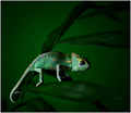
| 09/04/2006 01:27:35 PM | Timid by elsapoComment: gorgeous picture. the greens are fantastic, and it's all just a splendid job really. the wee guy i really cute; i love that he has a beady eye on the camera, and his facial expression is so "well, what?". the colours and the way the focus works around him and the leaves are all stunning. and, right now, i really fancy a budweiser. 10. | | Photographer found comment helpful. |
| 09/04/2006 01:12:47 PM | Portal to Tomorrowby sackerComment: i love how clean and bright and modernistic the metal elements are on this. the deep blue is also visually appealing, though the level of grain conflicts with that of the surrounding element. it's a great abstract though; more so given tha i can't tell what it is. the centred composition is nice too. this really stands out from the other submissions, and i was drawn to it as soon as i noticed the thumb nail. quite striking - 8. | | Photographer found comment helpful. |
| 09/04/2006 12:49:22 PM | Bond girlsby LevTComment: okay, this (as all things james bond) is a little bit silly. it's fun, very from russia with love for some reason, but a tad daft as well. it's also let down a bit by the fact the glasses on the right don't match the ones on the left in terms of opaqueness. a good laugh though - 7. | | Photographer found comment helpful. |
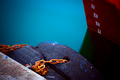
| 09/04/2006 12:46:55 PM | XIby bragurComment: love the hyper unreal tones of the colours. and the glass looking smoothness of the turquoise water is ttally gorgeous. to be honest, the graininess of the timber doesn't really fit in. or maybe it does. not sure now, but i think it's actually a good complimentary contrast. er. i wish the depth of field was greater; the slight softness of the numbers doesn't quite go and sticks out a bit. still, as a piece of visual abstract art, it's really effective and wall mountable. 9. | | Photographer found comment helpful. |
| 09/04/2006 12:42:51 PM | beauty and her beastby PurpleFireComment: i like this; it feels fun, loving, romantic and basically contently happy. and the emotions are infectious. the nice touches (the glasses, tattoo, and blowig hair) all add to the naturalness and candid feeling of the shot, and doesn't make it feel particularly staged. the background happens to be black, rather than it being a black background, if that makes sense, which i also like. the sepias work too. lovely - 9. | | Photographer found comment helpful. |
| 09/04/2006 12:38:42 PM | The Zinnia's faceby Trumpeteer4Comment: the face is uniformly blurry, which is a big issue with macros on flowers; the level of noise will also hurt your score. it feels like it was done on a mobile phone. an interesting species of flower though, and the colour reproduction is very nice, bold and rbight. but it needs better focus. 3. | | Photographer found comment helpful. |
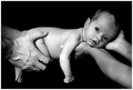
| 09/04/2006 12:34:37 PM | Newby jaxedComment: ok, another baby lying flat out, which is obviously the in vogue thing right now. not being a baby fan, i'm not going to be particularly moved here. however, technically i can see this is a really decent shot; lighting is top notch, the level of grain is pleasing yet unobstrusive. the arms on the right don't seem very relaxed and appears stiff, and i think it would be more fun if the sprog was glaring at the camera - i'd imagine the little bugger would have a decent glare on him. 7, which is high for me and baby pictures. | | Photographer found comment helpful. |
| 09/04/2006 12:27:31 PM | ENGLAND'S HEROby dippydazComment: unfortunately, i suspect the reference is a bit obscure for a lot of non brits to get... the silhouette is nice and sharp, but really doesn't hold enough interest. if more of the column, or indeed the square was in shot, it might be more effective. actually, just playing with it (if you have elements or similar) i tried making it lack and white, then fiddled with levels to makes the sky blacker and more contrasy. with a more panoramic crop (full width, half height from bottom corner) i think the composition works really well. anyway, erm, 4. |
Home -
Challenges -
Community -
League -
Photos -
Cameras -
Lenses -
Learn -
Help -
Terms of Use -
Privacy -
Top ^
DPChallenge, and website content and design, Copyright © 2001-2025 Challenging Technologies, LLC.
All digital photo copyrights belong to the photographers and may not be used without permission.
Current Server Time: 04/12/2025 10:55:17 AM EDT.
|