| Image |
Comment |
| 10/14/2005 05:34:48 PM |
|
 Photographer found comment helpful. Photographer found comment helpful. |
| 10/14/2005 05:33:48 PM |
Celebrate Friendsby Sherri1209Comment: This is an absolutely beautiful image and it works so well in sepia. I especially love the expression of the girl on the right. Unfortunately, it's not a sharp focus. The best thing to try for future shots is to focus as much as possible on the eyes of at least one subject. Professionals usually measure sharpness if they can see the eyelashes of a subject (of course, this is not always possible with moving subjects). For this scene, maybe shooting at f8 would have helped a bit and locking the auto focus down would have worked abit to improve focus. |
| Photographer found comment helpful. |
| 08/15/2005 08:05:10 AM |
driving in the rainby photom1946Comment: This looks like a software program that makes the image look like it's raining. However, I promise not to score based on that - but others may (this place can get downright picky when it comes to suping up photos with PhotoShop tricks). I do want to say though that I think a better composition would have been one where the truck was coming at us. As it is now, you have used effective composition for movement - you can understand the motion of the vehicle because there's room at the front implying where the truck is traveling to... however, I think it would have been more effective employing almost hte same composition, but the other way around (with th etruck coming at the camera) and with a bit of room in the front implying where the truck is traveling to. |
| 08/12/2005 07:56:04 PM |
1865 Rendezvouxby rjksteschComment: This is a great composition and a wonderful idea for this challenge. My suggestion (and keep in mind I'm only learning about B&W/Sepia myself) would be to have something almost pitch black and something as white as it comes. With two-tone images, anything with both of these will add a lot to your score - and to the overall image. |
| Photographer found comment helpful. |
| 07/12/2005 09:07:35 PM |
At your marksby FridrikComment: I really love the simplicity of this shot. The colours are pitch perfect. Perfection! 10 (the only image I've commented on in this whole challenge) |
| 07/07/2005 12:36:52 PM |
'Spotlight on the Unwanted'by suemackComment: This is an amazing amazing shot. The expression is perfection. The composition is absolutely excellent. I am in love with the shot, in fact... it's the kind you'd want to send to your friends by email to warm their day. I'd like to make a couple of small suggestions for future shooting - and keep in mind I'm terrible with lighting... but I'd suggest a bit of a higher contrast with the circle. Maybe even by putting the kitty in a darker hole, or painting part of the circle black. Even if this wasn't a circle challenge, it would have a greater impact of the shot and would illuminate this very beautiful creature. Bravo for the shot though. I really love it. 9 |
| Photographer found comment helpful. |
| 07/07/2005 11:57:59 AM |
Lightsby ofurpesiComment: You've probably already heard this is a bit small for DPchallenge. People with larger images tend to get higher votes. however, I'd like to comment on the overall image, since most people don't do that. I really like your approach and you left the shutter open the perfect amount to illuminate the single light. i'd suggest trying to visualize the finished product even as you're taking the shot. The blues are perfect, but I'd suggest trying to see some ofthe distracting elements like the pole behind and the roof. I'm not sure what a different angle would have produced, but maybe looking closer at teh light, or zooming into the light would have helped - and maybe taking it from a different angle would have removed the distracting elements. Also, while many centred shots work very well for effect, using the rule of thirds (where your element is on one/third of the image, usually has a higher impact visually. There are a lot of great articles about the rule of thirds online if you'd like. Good luck with this. i suspect it won't do as well as it deserves given its size, but hopefully we'll see more of your work in teh future. |
| 06/23/2005 05:47:09 PM |
|
| Photographer found comment helpful. |
| 06/23/2005 05:37:44 PM |
rhythmby MinstrelComment: Great composition and a nice idea for this challenge. I'd suggest using a tripod or - if you don't have one - trying to put your camera on something level. This image has nice lighting, but it appears to be slightly blurry. Good luck though. The vision for this was well thought out. |
| Photographer found comment helpful. |
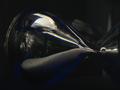
| 05/25/2005 07:44:58 AM |
Putting time on holdby scottstantonComment: This is a great picture. I really like the reflections along the top, but the reflection of the photographer in the middle fo the bottom of the glass is a bit distracting. I'm not sure how this could be corrected in future - to be honest, I'm new to the finer points of lighting - but maybe covering your background with a black sheet or something would have taken away the glare and the glass wouldn't have picked up your reflection. |
Home -
Challenges -
Community -
League -
Photos -
Cameras -
Lenses -
Learn -
Help -
Terms of Use -
Privacy -
Top ^
DPChallenge, and website content and design, Copyright © 2001-2025 Challenging Technologies, LLC.
All digital photo copyrights belong to the photographers and may not be used without permission.
Current Server Time: 04/07/2025 06:11:41 AM EDT.