| Author | Thread |
Comments Made During the Challenge  |
|
|
07/12/2005 07:35:03 PM |
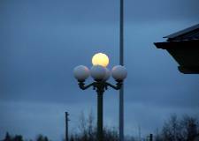
| The composition of this is off. The intrusion by what is probably a roof is very distracting. But so is the pole that is growing through your light globe. The size also hurts this photo. Most photo editing software has a way to resize the photo to submission size according to the rules. Keep shooting! |
|
|
|
07/11/2005 12:57:47 PM |
| way too small, you know this |
|
|
|
07/09/2005 11:48:02 AM |
//www.dpchallenge.com/tutorial.php?TUTORIAL_ID=26
Unfortunatly your shot is much too small to see any detail. Try this tutorial. If you don't have photoshop, most programs that come with a digital camera include these functions with a different name. Hope that helps. |
|
|
|
07/09/2005 03:56:40 AM |
| This one is way too small. It really needs to be bigger to see the details of the lamp. Also a different angle taking the picture would have eliminated the dark line running though the picture, a telephone pole maybe? |
|
|
|
07/08/2005 12:15:12 PM |
| Points off for a too small image that is difficult to evaluate |
|
|
|
07/07/2005 08:11:51 PM |
| Too small, but the concept is nice. 6 for mood and composition, -1 for the size (it's truly too small to appreciate fully). 5 |
|
|
|
07/07/2005 08:07:35 PM |
| too small and Out of Focus, |
|
|
|
07/07/2005 07:44:31 PM |
|
|
|
07/07/2005 11:57:59 AM |
| You've probably already heard this is a bit small for DPchallenge. People with larger images tend to get higher votes. however, I'd like to comment on the overall image, since most people don't do that. I really like your approach and you left the shutter open the perfect amount to illuminate the single light. i'd suggest trying to visualize the finished product even as you're taking the shot. The blues are perfect, but I'd suggest trying to see some ofthe distracting elements like the pole behind and the roof. I'm not sure what a different angle would have produced, but maybe looking closer at teh light, or zooming into the light would have helped - and maybe taking it from a different angle would have removed the distracting elements. Also, while many centred shots work very well for effect, using the rule of thirds (where your element is on one/third of the image, usually has a higher impact visually. There are a lot of great articles about the rule of thirds online if you'd like. Good luck with this. i suspect it won't do as well as it deserves given its size, but hopefully we'll see more of your work in teh future. |
|
|
|
07/07/2005 06:59:29 AM |
| I know you're probably getting tons of comments about the size of your picture, so I won't mention that. ;) I think the shot has potential.. but the surrounding objects are distracting, like the pole in the background and the roof (?) on the right side. I think closer shot taken from beneath or at a different angle would have been more interesting. |
|
|
|
07/06/2005 08:29:01 AM |
|
|
|
07/06/2005 08:19:39 AM |
|
|
|
07/06/2005 08:04:08 AM |
| Slighly more cropping and making it a little larger would have helped. Also the pole on the right is distracting. |
|
|
|
07/06/2005 05:43:12 AM |
| When you submit a photo this small, you don't allow voters to see what you've really photographed. I like the colors in the pic, and I like how the one lamp is lit up. The only other thing I can see with enough detail to comment on is the fact that one of the lights has a pole growing through it, which is something that could be corrected by moving to one side or the other while shooting. |
|
|
|
07/06/2005 05:03:50 AM |
| pity it's so small though, nice muted colours. |
|
|
|
07/05/2005 11:51:07 PM |
|
|
|
07/05/2005 11:49:25 PM |
| As this is a stationary object, I would suggest a different point of view so you dont end up with a pole running through your main focal point. I would also suggest some cropping so the distracting element (roof?) on the right is removed. Also, try to avoid centering your main subject in the center of your image - offset subjects can help create more visually appealing images. |
|
|
|
07/05/2005 09:12:48 PM |
| Wow...this is really tiny. You'll probably hear this a zillion times, but the best advice you'll get here is to submit a larger pic. If you got a 'file too large' message, then the ideal solution would be to compress a little smaller, rather than make the pic itself smaller. It's really hard to tell details from this small of a pic, but I will say that the strong vertical line through the image (a post?) is distracting as is the corner of the roof. The lights are interesting, but again, hard to see. It looks like if you had moved yourself to the right and closer to the groud and gotten up a bit closer on the lights, it might have been a better composition. Can't tell how focus is. Color is ok. ~Heather~ |
|
|
|
07/05/2005 08:59:16 PM |
| wow we have that exact same lamp on our porch! maybe position the camera in such a way that the pole in the background doesn't cut through your picture? :) |
|
Home -
Challenges -
Community -
League -
Photos -
Cameras -
Lenses -
Learn -
Help -
Terms of Use -
Privacy -
Top ^
DPChallenge, and website content and design, Copyright © 2001-2025 Challenging Technologies, LLC.
All digital photo copyrights belong to the photographers and may not be used without permission.
Current Server Time: 04/06/2025 10:49:42 PM EDT.