| Image |
Comment |
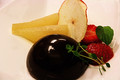
| 07/20/2012 08:23:34 AM |
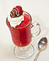
Three Cherries on Topby giantmikeComment: I love the angle, focal distance, and lighting. I think the lunch box(?) in the background is a little distracting, and the whole image would have benefitted from a lighter table top and/r background. |
 Photographer found comment helpful. Photographer found comment helpful. |
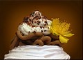
| 07/20/2012 08:20:08 AM |
Chocolate Chiboust with dried apples, honey cooked pears and lemon thyme by mrbig65Comment: I think this is one of the very best composed images in this challenge. It has great textures, good colors, interesting shapes, and is well balanced and cropped. The color balance seems a little on the red side. I think this image would have benefitted a lot from a single light source or a more interesting light source rather than what appears to be several overhead fluorescent rectangle lights. |
| Photographer found comment helpful. |
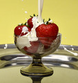
| 07/20/2012 08:08:35 AM |
Vermicelleby kasabaComment: I love the colors and the balance. I wish the yellows were a little brighter though. |
| Photographer found comment helpful. |
| 07/20/2012 08:07:47 AM |
Wimbledon's Smashing Treatby KroburgComment: One of my favorites because I LOVE action, especially in product photography. I really would have preferred if the subject was not dead center and at such a straight-on angle, since it moves all the action in the image out away from the frame. I find my eyes constantly just want to leave this picture and follow the splashes off the photo. |
| Photographer found comment helpful. |
| 07/20/2012 08:05:03 AM |
|
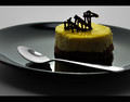
| 07/20/2012 08:03:34 AM |
Greecian Baked Cheesecake by hotpastaComment: Love the color. I would prefer to see the focal point not set dead center, and maybe an angle that included the same elements without having them so spread out around the frame. |
| Photographer found comment helpful. |
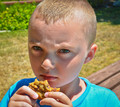
| 07/20/2012 08:01:20 AM |
This is mine...go find your own!!by ksierrasComment: As far as portrait photography goes, this little guy has one very bright nose, while the rest of his face is mostly in shadow. It isn't the most flattering of lighting choices, but it makes it look more like a snapshot taken by chance than an intentionally shot photograph. His cookie is somewhat insignificant in this cropping. If it was cropped down to the cookie, the hands, and the lips, the lighting may seem much more appropriate with the focus going primarily on the cookie and hands. |
| Photographer found comment helpful. |
| 07/20/2012 07:57:10 AM |
|
| Photographer found comment helpful. |
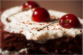
| 07/20/2012 07:52:53 AM |
Oby TiberiusComment: I really like the bold crop and the soft focus. Great job. I might like to see more green just to balance out the browns and reds. |
| Photographer found comment helpful. |
| 07/20/2012 07:51:45 AM |
The Loch Ness Pastry Monsterby wejnaComment: Great attention to detail. I would have preferred to see a tighter crop without the extra space under the plate especially. |
| Photographer found comment helpful. |
Home -
Challenges -
Community -
League -
Photos -
Cameras -
Lenses -
Learn -
Help -
Terms of Use -
Privacy -
Top ^
DPChallenge, and website content and design, Copyright © 2001-2025 Challenging Technologies, LLC.
All digital photo copyrights belong to the photographers and may not be used without permission.
Current Server Time: 04/11/2025 05:14:54 PM EDT.