| Image |
Comment |
| 02/02/2004 06:07:05 AM |
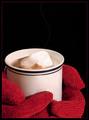
Titanicby sherComment: i really like this, but i'm not sure why its called titanice. i love the red gloves and the height of the negative space. i'm pretty sure that line of steam was photoshoped in, but its still nice. |
 Photographer found comment helpful. Photographer found comment helpful. |
| 02/02/2004 06:05:04 AM |
|
| Photographer found comment helpful. |
| 02/02/2004 06:03:34 AM |
|
| 02/02/2004 05:32:47 AM |
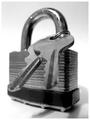
Lock & Keysby faidoiComment: dof here is a little shallow, or perhaps misplaced. if it could have been pulled ahead a bit so as not to lose the tips of the keys... |
| Photographer found comment helpful. |
| 02/02/2004 05:28:54 AM |
Moth in loveby PacloComment: wow - that is a great capture. i've been staring at this, marveling at how you were able to catch the moth so perfectly still (when those things fly it is a blur of powdery wing action) and yet achieve such a high level of detail and richness of color. i'm figuring the lightbulb must be giving off a fair ammount of light. nice composition, i dig the background, the lines, the rustic remnants of paint, the negative space. very nice. you get a 9. |
| Photographer found comment helpful. |
| 02/02/2004 05:23:36 AM |
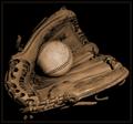
Battered Ball, Worn-out Gloveby HRoxasComment: hmmm, this is nice, i like the sepia tones, and the ball and glove come off as having a lot of character and history, but i find the square framing a little dull. i think a little more negative space above the glove would have been nice here. i like the black background, but with the soft contrast happening in the subjects it makes the overall image a little dim. not sure if white would be better or maybe just a little more contrast in the subject. this is easily an 8 with the potential to have been a 10. nice work. |
| Photographer found comment helpful. |
| 02/02/2004 05:16:23 AM |
Cup & Saucerby PaulMdxComment: nice and simple. good placement of the subject, i like the white space. the lighting is nice and even except for a touch of overexposure on the top inside rim. |
| Photographer found comment helpful. |
| 02/02/2004 05:14:13 AM |
Hot vs. Coldby tyrkinnComment: this image is a tad chaotic - there is nothing drawing my eye in any controlled direction - i'm shifting all over the image with all the lines and breaks in space. in a way i find this interesting, but i still think it could have used a little more control. |
| Photographer found comment helpful. |
| 02/02/2004 05:05:15 AM |
Pen and Paperby SharonSComment: normally i find color really does wonders for a photo, the more the merrier, but this seems to have stepped just a little bit over the edge. great composition, use of negagive space, and the lighting is nice and even. the pen and paper are just a little tacky for my taste. |
| Photographer found comment helpful. |
| 02/02/2004 04:57:14 AM |
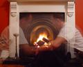
A nice fire in the grateby johnmComment: the composition of the fireplace seems a little flat. did you mean to have that basket sticking in on the left side - it seems kind of haphazardly out of place. i see the effect you used here in the taking of the photograph, but i'm not seeing why two semi-transparent images of a person by a fire are being used here - it seems tacked on. you obviously have strong photographic potential, i think there just needs to be a little more consideration put into it. |
| Photographer found comment helpful. |
Home -
Challenges -
Community -
League -
Photos -
Cameras -
Lenses -
Learn -
Help -
Terms of Use -
Privacy -
Top ^
DPChallenge, and website content and design, Copyright © 2001-2025 Challenging Technologies, LLC.
All digital photo copyrights belong to the photographers and may not be used without permission.
Current Server Time: 04/07/2025 06:12:52 AM EDT.