| Author | Thread |
|
|
05/12/2004 07:51:49 PM |
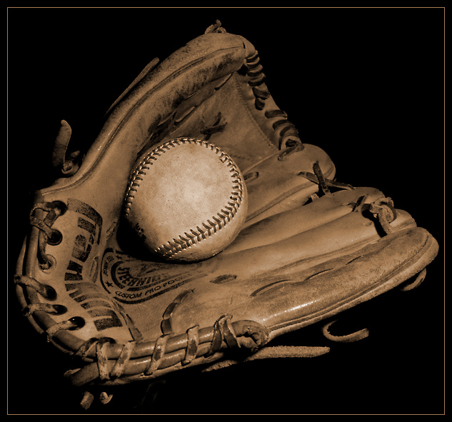
| Boy, another one with beautiful toning/background. I love baseball shots. |
|
 Photographer found comment helpful. Photographer found comment helpful. |
|
|
02/09/2004 03:05:30 AM |
| Great feel for this picture. Congrats on its 7th place! |
|
| Photographer found comment helpful. |
|
|
02/08/2004 07:38:58 PM |
| congrats on top 10 finish! |
|
| Photographer found comment helpful. |
Comments Made During the Challenge  |
|
|
02/08/2004 06:53:46 PM |
| Nicely lit and toned. They go well together and there's so much texture for the eyes to feast on. My top 3 this week. |
|
| Photographer found comment helpful. |
|
|
02/07/2004 04:06:49 PM |
| I recently took a photo of a ball and glove, and it sucked. Nice job on this. I know this isn't easy. |
|
| Photographer found comment helpful. |
|
|
02/04/2004 06:03:01 PM |
| very nicely done a ribbon for you I think! |
|
| Photographer found comment helpful. |
|
|
02/04/2004 08:01:04 AM |
| Good shot, good lighting and good contrast |
|
| Photographer found comment helpful. |
|
|
02/03/2004 04:03:54 PM |
| Great concept and sepia lends well to the "antique feel". I almost wish it was a bit brighter but it's not that big a deal. Excellent focus, too. |
|
| Photographer found comment helpful. |
|
|
02/03/2004 12:32:29 PM |
| I do like the idea but the glove & ball don't seem all that battered and worn out. |
|
| Photographer found comment helpful. |
|
|
02/02/2004 06:49:19 PM |
| I like it! You should score very well with this picture. |
|
| Photographer found comment helpful. |
|
|
02/02/2004 02:44:42 PM |
|
| Photographer found comment helpful. |
|
|
02/02/2004 11:19:39 AM |
| Sepia/brown tones look really good against the rich black background. Focus is clear and crisp and lighting is good as well. Good job. |
|
| Photographer found comment helpful. |
|
|
02/02/2004 09:54:59 AM |
| Nice light and tones. This is good. |
|
| Photographer found comment helpful. |
|
|
02/02/2004 05:23:36 AM |
| hmmm, this is nice, i like the sepia tones, and the ball and glove come off as having a lot of character and history, but i find the square framing a little dull. i think a little more negative space above the glove would have been nice here. i like the black background, but with the soft contrast happening in the subjects it makes the overall image a little dim. not sure if white would be better or maybe just a little more contrast in the subject. this is easily an 8 with the potential to have been a 10. nice work. |
|
| Photographer found comment helpful. |
|
|
02/01/2004 11:59:46 PM |
| A lovely "still life" kind of image... seems to convey a whole life story. |
|
| Photographer found comment helpful. |
|
|
02/01/2004 08:58:34 PM |
| This has a very classy feel to it. The nostalgic colours, the oldness of the leather, the black backing. I think, for me, the best thing here is the tonal range. Very nice. Just one little gripe, for me, the challenge wasn't to shoot things which are commonly used together, but to create interesting combinations. 9 |
|
| Photographer found comment helpful. |
Home -
Challenges -
Community -
League -
Photos -
Cameras -
Lenses -
Learn -
Help -
Terms of Use -
Privacy -
Top ^
DPChallenge, and website content and design, Copyright © 2001-2025 Challenging Technologies, LLC.
All digital photo copyrights belong to the photographers and may not be used without permission.
Current Server Time: 04/07/2025 12:05:42 AM EDT.