|
|
| Image |
Comment |
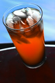
| 10/16/2006 04:47:19 PM | Don't You Want-a Fanta?by JPetraliaXComment: greetings from the critique club!
Congatulations on attempting new ground! I can see from your portfolia that you have a creative eye and are not afraid to take risks. While your self critisism is perhaps to harsh ("lame"), I think we can discuss a few ways that might strenthen your image.
I think that the comments that you received about over "Neat-imaging" are valid. I imagine that your goal is produce an irresistable beverage. To me that implies the need for crisp, clean, and refreshing. By softening the tones you work against that goal. We are left with a rather ho-hum drink that matches the rather ho-hum sky.
There are distracting technical elements that could not be cured in a basic editing challenge, but in post production (or in pre-shot planning)I would get rid of one of the horizontal lines. The currved white tables edge competes poorly with...(is that the balconeys edge?) the other strong horizontal. Alot of distortion exists between this "balconeys edge" and the horizon. I might have wiped up the mess from the root beer float experiment...the dirty table does nothing for "clean and crisp".
Compositionaly I am am set off by a couple of elements. I think what you want acheive is that the viewer wants to jump into the frame and take a sip. The tilted angle of the glass and table, with no corresponding angle with the liquid in the glass leaves me wondering when will this glass overflow, or when will this glass slide right off of the table. I'm left feeling like I better run for a towel.
Perhaps your intent was to create the effect that the beverage might just slide out of the frame and into my hand? Compositionaly, let's work on enhancing that concept. I am a big fan of strong diagonal lines, and you acheive part of this effect by your angled pesentation of the glass. But wouldn't that concept be more effective with the glasses base positioned in the lower right corner. The diagonal line would be more emphasized, the meaningless foreground would be out of frame, and you would gain the emotions of anticipation and expectation. Wouldn't that help you improve the emotive of the dreamy ice cubes blossoming into the dreamy sky?
Nice work. You get a 6 from me!!
russ
|
| 10/16/2006 02:43:02 PM | Spriteby russiComment: greetings from the critique club
Congratulations on your high finish and very interesting shot!!! I like it alot and find great humor in the capture. The impression that I'm going to run with is that this man is half-mad to catch this refreshment.
A couple of things technically first. I'm not sure that the reflection works for you here. The two strong competing elements, Man chases refreshment, don't need extra data, and the reflection reduces the mania, at least for me. While the rules of basic editing would prevent you from softening the hard white line produced by the counters edge, I would soften it substantially in post production.
There are strong elements to your composition that I like alot. The crazed looking man with bloodshot eyes and mussed up hair are dynamic and humorous. As well, the slight tilt of the beverage to the right gives the viewer just the slightest feeling that the beverage intends to escape.
I think that this emotion of "cat and mouse" could be strenthened with three techniques. To emphasize the excitement of the chase I might crop differently, in two different ways. First, I might add more white space to the right side. The strong visual line created by the mans gaze to the bottle I think could be strenthened by continuing that line to give the bottle somewhere to escape to. Second I might crop more narrowly to intensify the drama of the chase. Lastly, you could exagerate the bottles desire to run by tilting it even more toward the escape route therby emphasizing even further the "catch me if you can" emotion that I think is your goal here.
Very nice work. You get a 7 from me!!
russ |  Photographer found comment helpful. Photographer found comment helpful. |
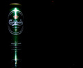
| 10/16/2006 05:55:24 AM | Dos Equis Lager Especialby freakin_hilariousComment: Greetings from the critique club!
Cogratulations on your strong finish and fine macro!
I would have no idea how the commercial photographers create condensation on beer bottles, but I imagine it is done with silicon or plastic droplets applied to the bottles in exactly the most strategic and appealing places. That way the bottle never dries out or gets soggy and they can plod along between photo and computer until they get exactly the result they want.
Under the confines of the basic editing guidelines there wasn't much you could do about the hot spot at the top of the label, nor could you crop out the the many light reflections that are so small to appear as digital noise. I'm sure that the agency producing magazine ads for Dos Equis would never have accepted all those little white specs all over their fabled Cuauhtemoc's cheek, and head dress. Interesting that this partcular challenge used the basic editing rules, when indeed the avertising agency itself is all about post production.
That's all I can say technically. Your shot is balanced, dynamic and well done. I can address the topic of brand familiarity. I know this label well because I drink beer and I live in Mexico. Many times advertisers will create such an ad just to remind the loyals they are still around. But if this ad were created to attract new customers, it doesn't include enough information. As another commenter suggests, the second X is obscured. We are pretty sure it's a beverage, because of the condensation. But can a new potential customer understand the brand? It all depends on your intent as a photographer and the medium in which the ad was to be placed.
Love your work. You get a 7 from me!!
russ
| | Photographer found comment helpful. |
| 10/16/2006 05:01:00 AM | Guinness, The Timeless Classicby cutlassdude70Comment: Greetings from the Critique Club!!
Congatulations on a fine score, and fine portrait!! I've looked through your portfolio and find your success with this shot to be at all "beginners luck". You have a fine eye and some great technical skill. Your interpretation of the challenge is spot on, you have made me thirsty!! Good job.
Within the constraints of the basic editing guidlines you were prohibited from reducing the glare on the glass, correcting her bloodshot left eye, or removing the digital noise spot from the flip near the end of her hair. But now that the hooplah has faded, I would revisit those issues in postproduction.
For me, the distacting element in the photo is in the cropping department. The model is clearly more interested in something out the window, or at least in the same direction as the light source than she is in the beer. I am left feeling "what's going on out there?". Leaving some imagination to the viewer is fine. In this case I'm thinking there is probobly some hunk at the bar.
With such a strong glare from the model into the same direction as the source of the glare on the glass, wouldn't it be nice to give us additional mystery by extending the cropping to include more negative space in the direction of the light source? With such strong visual lines, glare and gaze, I might have tried to extend those dynamics by using a wider crop to enhace where all of the energy of the frame is already headed.
Nice work. You get a 7 from me!!
russ
| | Photographer found comment helpful. |
| 10/15/2006 10:22:16 PM | The Sunsetby gocComment: Hello again gooc!
I dont recall ever being asked to review two photos by the same photographer back to back before. At least I have seen your technique of the strong forground subject against the distant background before! You have a strong eye for this particular type of presentation.
I like the way that you have used the fill flash to seperate the subject from the background and to bring out the colors. Nice work! Did you use a fill flash in the daisies on tires shot as well?
As you said in your comments, the birds don't work. I would clone them out. Did you experiment with darker and lighter skies? I am wondering if a solid black background might be very dynamic. And also wondering if a lighter sky might bring out the colors in the flowers even more.
Nice shot. I give you a 6!!
russ
| | Photographer found comment helpful. |
| 10/15/2006 10:07:32 PM | Beer is the best partby duskerComment: Not much I can add to the comments that you have already received. Nice use of reflection, negative space, and good composition.
Clone out the digital noise the otheres have mentioned, i.e. red spot at top and lower right. Use flash diffusion to avoid the harsh glare.
You made me me thirsty!! Good job. You get a 7 from me.
russ |
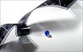
| 10/15/2006 08:04:54 PM | The shadow makersby IreneMComment: This is a very strong composition, and I like it alot.
I might have tried three things differently. The strong diagonal lines that are created by both the negative roll and the shadow it casts are great. However, I might have cropped a little tighter on the right side. If you notice just a few milemeters of white space exists in the bottom left, as the negative roll fades out of the frame. In the top right, several milemiters of white space exist. I think that is throwing the composition out of whack, like the photo is too long for it's width.
I also might have rolled the marble a little more into the lower third. Cropping the right side would have moved the marble into a more dynamic position as well, but I think you would gain a seperation from the shadows cast by the film and the marble by creating some extra distance. Never underestimate the rule of thirds. Put that marble on the cross-hairs.
The last suggestion is to tone down or crop out the reflection on the film roll that is creating a sharp bright triangle just to the left of the marble. It definately draws my eye, and almost looks like the film is cut. I think without that competing distraction your unrelated subjects would contrast more.
Very nice work. You get a 7 from me!!
russ
| | Photographer found comment helpful. |
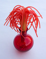
| 10/15/2006 07:45:32 PM | Not Just Another Flower Pictureby LoreneComment: A very clever idea and well composed shot.
I might have tried to strenthen it in two ways. I think that the reflection off of the vase is distracting. If I had thought of it, I might have pulled the drapes closed or in post production cloned it out.
The socond improvement that crosses my mind is that the blueish tint to the white background melts a little of the excitement. A glossy white background might just make your subject jump from the page. I might have tried white balance in camera, or in post production painted it.
It is a fun shot. You get a 7 from me!!
russ | | Photographer found comment helpful. |
| 10/15/2006 07:27:50 PM | Protected Natureby gocComment: A nice selective focus shot with enough "enrelatedness" to satisfy my very wide interpretations of theme. Nature vs. man, black vs. white, etc.
I am distracted by two elements of the shot. I might have cloned out or muted the bright green color blotch in the backgrounds center, as it distracts from the subjects, flowers vs. old tires. I also might have cropped a little tighter to avoid the edge of the tires left from causing a very nice diagonal line to kind of fall off. My eye keeps returning to both of these elements, and I find them distracting.
Very nice work though. You get a 7 from me.
russ | | Photographer found comment helpful. |
| 05/19/2004 02:41:29 AM | Dead man's handby keoneComment: my recollection of the dead man's hand is two pair.......aces and eights.....all black. could be wrong. just like most of my poker calls. | | Photographer found comment helpful. |
Home -
Challenges -
Community -
League -
Photos -
Cameras -
Lenses -
Learn -
Help -
Terms of Use -
Privacy -
Top ^
DPChallenge, and website content and design, Copyright © 2001-2025 Challenging Technologies, LLC.
All digital photo copyrights belong to the photographers and may not be used without permission.
Current Server Time: 04/07/2025 06:14:46 AM EDT.
|