| Author | Thread |
|
|
10/16/2006 02:07:32 AM |
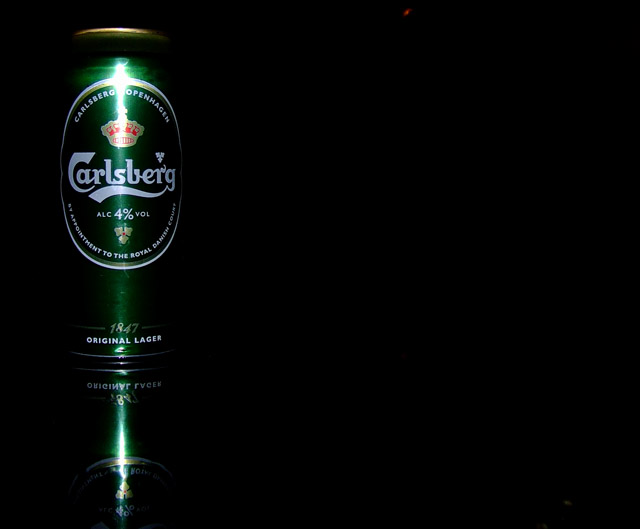
Not much I can add to the comments that you have already received. Nice use of reflection, negative space, and good composition.
Clone out the digital noise the otheres have mentioned, i.e. red spot at top and lower right. Use flash diffusion to avoid the harsh glare.
You made me me thirsty!! Good job. You get a 7 from me.
russ |
|
Comments Made During the Challenge  |
|
|
10/10/2006 10:48:33 PM |
| I love it. The reflection adds a lot as well. I like all of the negative space. Two things that are distracting, the red dot in the top (with basic nothing you can do) and the bright spot on the can. Great job. |
|
|
|
10/10/2006 06:12:18 PM |
| I like this one. The can has no distinct outline which works well. The lighting highlight is harsh, though. |
|
|
|
10/09/2006 11:10:46 PM |
| This really caught my eye. Nice. |
|
|
|
10/09/2006 05:23:13 PM |
| I can see this with text in the empty space, neat idea. Less glare on the can would be nice though. |
|
|
|
10/09/2006 06:12:53 AM |
I like the negative space. I like the idea in general
The highlight due to the flash kills the detail and is a bit distracting. |
|
 Photographer found comment helpful. Photographer found comment helpful. |
|
|
10/08/2006 11:36:58 PM |
| Almost perfect. Only this is that red blob at the top, and the darker one at the bottom right. |
|
| Photographer found comment helpful. |
|
|
10/07/2006 10:22:15 AM |
| Great comp, very interesting and serviceable for text placement. Nice product presentation. The only thing is the lighting a bit more diffusion on the flash would've really helped this but a nice overall job. |
|
| Photographer found comment helpful. |
|
|
10/06/2006 10:21:12 AM |
| This could be a good advertisement. An interesting shot and a lot of space to write the advertisement on the right. I'm just afraid of the strong light reflection on the can. |
|
| Photographer found comment helpful. |
|
|
10/05/2006 12:31:25 PM |
| i like the negative space |
|
|
|
10/05/2006 03:41:12 AM |
| reflection is a little harsh |
|
|
|
10/04/2006 08:57:49 PM |
| The light on the can is a pit much, but it is a great picture. |
|
|
|
10/04/2006 06:36:55 PM |
| Sweet simple satisfying to the eye. There is a blemish red spot at the top, but it is so easily fixable that I am not counting it against the magnificent image. Great job. GL. |
|
|
|
10/04/2006 04:57:41 PM |
really annoying red speck near top, just right of middle and another gray in lower right corner. overlit close to top of can.
good comp (if a little too close to edge) but technical flaws bring it down. don't worry about that, technique you can always learn, composition is more difficult. |
|
| Photographer found comment helpful. |
|
|
10/04/2006 12:47:52 PM |
| What is the little red dot floating around in the big black space ;) |
|
|
|
10/04/2006 01:01:11 AM |
| Love the composition and the lighting looks good, minus that (always hard to get around) hot spot. |
|
| Photographer found comment helpful. |
|
|
10/04/2006 12:36:58 AM |
| you shouldn't use direct flash on a metallic surface. |
|
Home -
Challenges -
Community -
League -
Photos -
Cameras -
Lenses -
Learn -
Help -
Terms of Use -
Privacy -
Top ^
DPChallenge, and website content and design, Copyright © 2001-2026 Challenging Technologies, LLC.
All digital photo copyrights belong to the photographers and may not be used without permission.
Current Server Time: 02/01/2026 11:09:17 AM EST.