| Image |
Comment |
| 08/17/2006 11:51:04 AM |
She Hates To Be Betrayed by De SousaComment: Nice entry. Photos with an easily recognizable story are fun. Good colors here, lighting looks good too. There's some weirdness in the uniform, not sure what, has a strange muted aspect like its been neat imaged, maybe some other PP was done to it. I'm not sure if seeing the man's eyes would be better or not, the fact that they are shadowed makes me want to see them yet it does lend a bit of mystery and anonymity to him. The blurry heel of the woman's left foot is a tad distracting so if more of it were in shadow the image would be even better. Only other thing is the bit of string from the woman's underwear or lingerie that is showing on her thigh. Normally probably not a big thing, but due to the position she's in and the light highlighting that area it becomes noticeable and a little distracting. Overall a very good image that coupled with the title has a great story to tell - without the title all sorts of other stories can easily be found it in too which is a great thing. I gave a 6 |
 Photographer found comment helpful. Photographer found comment helpful. |
| 08/17/2006 11:44:50 AM |
Flareby elsapoComment: Beautiful fire here. Love the contrasts in color and the lighting looks good. The focus seems to be off in some areas, to be expected when dealing with fire as a subject I think. Nice composition but I'm not sure I like the white border, even though its rather thin it still seems to draw attention to itself rather than just frame the image. I gave a 6 |
| Photographer found comment helpful. |
| 08/17/2006 11:42:07 AM |
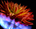
Dahlia Flambéby banmornComment: Fabulous colors here and the focus is great. I wish there was a bit more light coming in on the side just to brighten it up a touch more. Also I think composing it so that black portion in the bottom left corner was gone would give the image a more seamless look - tilting the subject (or camera) so that it appears to be rising up out of the corner rather than just cropping and losing some of the interesting features would probably be best. Other than that I think its a great entry. I gave a 6 |
| Photographer found comment helpful. |
| 08/16/2006 01:14:07 AM |
Cocktailby DjabordjaborComment: I haven't the faintest idea what's in there but I like the dynamic feel of this image. Great mix of two elements, fire and water. The focus looks great and the lighting seems just right. I wish the image didn't feel cramped on the right side but that's a fairly minor issue. I also feel like I'm missing some of the details of what's going on from the further back view, not sure if that makes sense, I like being able to see the action in its entirety but I long to get up close and personal with the mix of fire and water and see what's going on there. Still this is a great shot. I gave a 7 |
| Photographer found comment helpful. |
| 08/16/2006 01:10:22 AM |
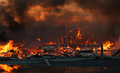
burn village BURN!!!by DjFenzlComment: Nice image. Feels very apocalyptic or like it could be in some movie. The flames look great, the structure is nicely capture - good focus and everything. I love the way the sky looks as its picked up smoke and heat from the flames. Very 'hellish' in my estimation. I sure hope no one was hurt in the making of this image! I gave a 6 |
| Photographer found comment helpful. |
| 08/16/2006 01:08:46 AM |
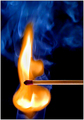
Shadow and Flameby indridistefansComment: Great flames. I like how they form a column almost. Nice color to them as well. They do seem a bit muted though, not sure why, as if they could be just a bit more vibrant - maybe its the distance if it were closer in it'd be brighter.. I don't know. I gave a 5 |
| Photographer found comment helpful. |
| 08/16/2006 01:06:52 AM |
Hot Cardby brimacComment: Nice image. There's a good feeling of motion and there are a lot of ways to see what's being portrayed. I see it more as a freedom from the card like its being burned AND tossed away, though I'm guessing that wasn't the intent. Rather basic in composition, which is nice. Lots of clean negative space to bring the attention to the card and flames. Lighting seems a bit harsh, focus is good though a bit soft to my eyes. Overall I gave a 6 |
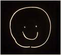
| 08/16/2006 01:04:51 AM |
Smile!by NuzzerComment: Simple. Cute. Fun. Not much I can say to offer improvements as the image is as I said simple - not to make or anything, just very basic and bare bones. I like it. I'm giving a 6 |
| Photographer found comment helpful. |
| 08/16/2006 01:03:33 AM |
F L A M A P P L E ?by NaldComment: Nice. I like the shape and color of the flames. I like the composition as well. Nice use of light and the focus is great. I'm curious whether this would look better with a green apple so the contrast between flame and fruit is much greater. I have to say I hate the border, definitely pulls attention from the subject, where it much thinner I think the effect would be much better. I gave a 6, probably would give a 7 with a different border - it aggravates my eye that much. |
| Photographer found comment helpful. |
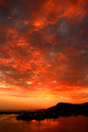
| 08/16/2006 12:59:02 AM |
Sky on Fireby postoakinversionComment: Interesting take on the challenge. I love the colors and the cloud mass is amazing. I like how insignificant it makes the shoreline look and that's a very nice contrast - well envisioned. Though I can see this fitting the challenge in an abstract way I think, per the challenge description, that there should be actual fire in the images and so I am compelled to dock from this otherwise lovely image. I gave a 5. |
| Photographer found comment helpful. |
Home -
Challenges -
Community -
League -
Photos -
Cameras -
Lenses -
Learn -
Help -
Terms of Use -
Privacy -
Top ^
DPChallenge, and website content and design, Copyright © 2001-2025 Challenging Technologies, LLC.
All digital photo copyrights belong to the photographers and may not be used without permission.
Current Server Time: 04/07/2025 06:09:17 AM EDT.