| Image |
Comment |
| 08/20/2006 01:55:19 PM |
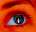
Red-eyeby TygerrComment: This has an interesting though creepy feeling for me. I like the intensity of the red and the way it contrasts with the blue iris. The flame in the eye is an interesting touch too. It looks like the whites of the eye have been way overprocessed though, very unnatural and the area around the eye seems oversmoothed (this may not be the case but it looks that way to me!). I like that you went in a more untraditional bent than some of the other entries, even if it isn't as appealing to me personally. I gave a 5 |
 Photographer found comment helpful. Photographer found comment helpful. |
| 08/20/2006 01:52:21 PM |
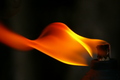
Tiki in the windby skieruscanComment: Nice movement in the flame. Good color. Lighting is nice too. I wish the focus were a bit sharper but I do like how the flame originator (the tiki) is more muted so the attention can center on the flame without distraction. I gave a 5 |
| Photographer found comment helpful. |
| 08/20/2006 01:51:03 PM |
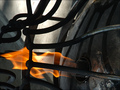
Flame Throwerby quiet_observationComment: I like this image, the lines of the cage are great. The contrast of the fire and the blackened iron/steel looks nice too. Lighting looks okay, focus looks good but could probably be somewhat sharper. I wish it had been rotated 90 degrees too. When I tilt my head I can see the flame almost as a figure that's trapped behind cage bars and that notion makes the image even more interesting to me. Just a thought though! I gave a 5 |
| Photographer found comment helpful. |
| 08/20/2006 01:48:45 PM |
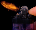
Fire Starterby jdannelsComment: Meets the challenge. Has some interesting colors too. The lighting looks okay but the focus seems slightly off, not quite sharp enough to start with, maybe more fill light is needed. Not sure. I gave a 5 |
| Photographer found comment helpful. |
| 08/20/2006 01:46:40 PM |
Sun Grownby heathenComment: Some great focus here. Certainly meets the challenge. Good contrast between the subject and the background. There's some strange.. pixelling or something in the cigar after the label though that's somewhat weird and I'm not sure why its there, compression maybe? The lighting looks good and the composition is simple but effective. The subject doesn't interest me much though. I gave a 5 |
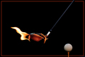
| 08/20/2006 01:44:33 PM |
Foouur!!by spydrComment: Fun image. I like the idea and the composition is spot on. I wish the lighting was a bit better on the ball/tee and the focus was stronger on the flaming club though. Something like this needs to be tack sharp to me simply because it has a simple set composition and the eye is riveted to the two subjects. I gave a 5 |
| Photographer found comment helpful. |
| 08/20/2006 01:42:45 PM |
Chasing Demonsby labudsComment: Coming back to comment and I think this is a fantastic image. Great movement and action. I love the graffiti art in the background and your choice of highlighting it really works well. The focus is excellent, the control of the lighting is perfect. Everything that needs to be seen is very well lit but not so much that its harsh or unattractive. I started this at a placeholder 5 but the more I look at it, the more I see different elements that have been handled very well and the more I like it. Bumping to an 8 and adding a favorite. |
| 08/20/2006 01:40:01 PM |
Tiki Torch at Sunsetby Kage01Comment: I like the sunset in the background and the fact that the torch has a nice bit of clarity is good. I wish the lighting wasn't quite so harsh on the torch though. The small size of the image detracts a bit as well. If a reshoot is possible, I'd suggest a slightly different perspective so that you don't have those white things at the bottom of the torch, without having to crop out some of the deeper colors of the sky. I gave a 5 |
| Photographer found comment helpful. |
| 08/20/2006 01:38:19 PM |
Short Fuseby cislanderComment: I like this image, there's nice clarity and contrast with the main subject and the lighting is excellent there. I do think this would be more powerful if the hand was cropped out. There is a lot of life, clarity and action in the sparks and whatnot so it makes the duller, less lit fingers look subpar in comparison. Cropping the fingers out instantly keeps the attention on the spark area and leaves it there, nothing for the eye to wander to. I gave a 5 but without the fingers I would've rated it in the 6 for sure possibly 7. |
| Photographer found comment helpful. |
| 08/20/2006 01:33:56 PM |
"Fire Lake"by tfarrell23Comment: Beautiful. Love the seascape and the way the orange/pink/red tones of the fire contrast with the cooler blues of the water. The silhouetting is very nice and keeps that part of the image simple so the fire can play center stage. Nice focus and the composition is great. I gave a 7 |
| Photographer found comment helpful. |
Home -
Challenges -
Community -
League -
Photos -
Cameras -
Lenses -
Learn -
Help -
Terms of Use -
Privacy -
Top ^
DPChallenge, and website content and design, Copyright © 2001-2025 Challenging Technologies, LLC.
All digital photo copyrights belong to the photographers and may not be used without permission.
Current Server Time: 04/07/2025 06:09:34 AM EDT.