| Image |
Comment |
| 07/21/2002 06:55:00 PM |
Slice of Pie in the Skyby spidermanComment: Nicely captured. A little bit grainy -- even in the black, but I'll forgive that. :-) Not a lot to say. I wonder how differnt compositions of this would have looked, but I also like the one you've submitted. |
| 07/21/2002 06:58:00 PM |
Koko's Silhouetteby HendrikComment: Yay for Kokopelli! I have this little guy on a keychain attached to my camera bag. I think this might have been better as a vertical and not a horizontal and I also would have gone ahead and added even more wrinkles/creases to the bacground -- but some people don't seem to like that. I think it would have made the lighting that much more interesting in the background to sue a crumpled paper effect. |
| 07/21/2002 11:16:00 AM |
Cheeky Chapby MartinComment: This is a great shot that looks like it's been blown up just a bit too much. The focus is just a tiny bit soft, and even though there is a good range of tone, the color is a tad monochromatic. I'm jealous of the opportunity to shoot otters though. :-) |
| 07/15/2002 01:15:00 PM |
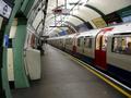
Tubeby networkguyComment: "Mind the Gap! Stand clear of the doors please." -- Only probably not in that station -- too straight for a gap. (A "real" critique to come later.) |
| 07/21/2002 04:46:00 PM |
Yeaaaa...an audienceby jbolingComment: Wow, really fun picture. Would it have been possible to get more squarely on to the window instead of off to the side? Or maybe to have straightened things up a bit in an editing program? Love the little girl's (?) hands up against the glass. Wish the other child's head wasn't being blocked by the rail. Nice timing as the one seal was banking and flippers outstretched. |
| 07/21/2002 06:16:00 PM |
Fireside Anguishby sulamkComment: I'm sorry, but this just doesn't work for me. I'm guessing it's a macro of a small statue in some strange lighting. It's just not sharp enough for me and I can't really say I like the cropping -- way to close to the eyes with not enough of the torso really visible. |
 Photographer found comment helpful. Photographer found comment helpful. |
| 07/21/2002 06:54:00 PM |
High Rollerby ShiiizzzamComment: Saw a similar shot over at Photosig -- don't think it's your work -- the dice look different. As silly as this will sound, it looks like you had a hair on the negative -- over on the left hand die at the top. The light coming out of the foreground holes is just a little too hot -- like the way it looks on the ones in the back better. I'm also gonna be picky in a stupid way. I know you meant for the 4 and 3 that point toward the camera to indicate the lucky number 7. But one of the dice actually has either a 6 or a 1 pointed up, and the other hase either a 5 or a 2. So this roller rolled either, 3, 6, 8, or 11. :-) Like I said being honery just for the sake of it. :-) |
| 07/21/2002 12:25:00 PM |
Casino Chipsby popsComment: Nice collection of gambling chips. Doesn't do much for me visually though. I think this would make a good background for something -- but it needs a visual anchor point -- maybe a coin bucket from one of the casinos? Something that ties to the background -- not exactly sure what to suggest though. |
| 07/21/2002 07:07:00 PM |
Feeling the Soul of Jazzby TomNTexasComment: Oh that the bow were being held in a position that didn't cover his face. I don't know where you were and this was probably impossible, but I wish this could have been from seveal feet to the left. The tonal range on this seems a little flat overall -- the only real shadows/blacks are around the violin -- would be nice if ther est wasn't quite so grey. |
| 07/21/2002 07:08:00 PM |
passing thoughtsby heartsdivideComment: I like the composition and the idea, but the B&W needs a little bit of a levels adjustment I think. This is so grey -- it needs some differentiation between white and blacks and middle values. |
Home -
Challenges -
Community -
League -
Photos -
Cameras -
Lenses -
Learn -
Help -
Terms of Use -
Privacy -
Top ^
DPChallenge, and website content and design, Copyright © 2001-2025 Challenging Technologies, LLC.
All digital photo copyrights belong to the photographers and may not be used without permission.
Current Server Time: 04/11/2025 04:35:59 PM EDT.