| Author | Thread |
Comments Made During the Challenge  |
|
|
07/21/2002 11:08:00 PM |
| I like the composition and the idea, but the B&W needs a little bit of a levels adjustment I think. This is so grey -- it needs some differentiation between white and blacks and middle values. |
|
|
|
07/21/2002 07:55:00 PM |
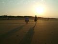
| This may not make sense, but I like the distance this picture has. I guess because it spills out of the top and left, so you can't really read what it is and the bw makes it seem moody. The viewer is there, but not there. he can see it, but can't experience it. |
|
|
|
07/21/2002 09:35:00 AM |
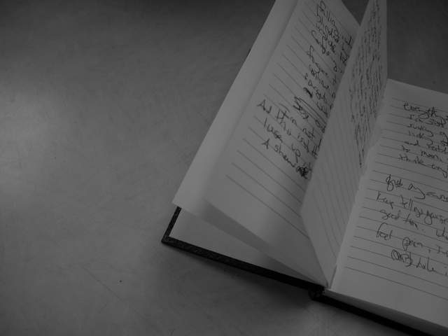
| i love the handwriting and the note book, nice compositions, but a bit too dark |
|
|
|
07/21/2002 08:39:00 AM |
| I like the idea but it's too dark |
|
|
|
07/20/2002 06:24:00 PM |
| I like it. I like it a lot. I'd give this one a 10 |
|
|
|
07/20/2002 06:07:00 PM |
| nice idea for a shot..........but it just seems like it needs something more..not sure what though --7 |
|
|
|
07/20/2002 06:02:00 PM |
| Don't know if it needs so much "blank" area to the left; I might have tried a vertical crop instead. Diagonal lines don't reproduce well, especially when resampled to low resolution and after JPEG compression. |
|
|
|
07/19/2002 04:48:00 PM |
| Beautiful composition, but I'd like to see more contrast between the background and the paper. The overall photo is just looking too gray now. |
|
|
|
07/19/2002 04:15:00 PM |
| there's a little pixelation visible, this is likely due to your very small file size (17k). try and use more of the allowed 150k. check out the tutorials (or PM me) if you need help. i like the composition with the note book only partially in the shot, and b&w is probably not a bad idea here, however, your shot is gray on gray. the pages should be white and you need more contrast. play with the levels in your photo processing software, even just using 'auto levels' makes a huge difference. -- gr8photos (4) |
|
|
|
07/19/2002 03:08:00 AM |
|
|
|
07/19/2002 12:30:00 AM |
| too dark. messy handwriting! nice concept! |
|
|
|
07/18/2002 12:22:00 PM |
| Interesting composition and idea...could do with a bit more contrast though. |
|
|
|
07/17/2002 10:41:00 AM |
| nice concept. wish there was something else in the picture. |
|
|
|
07/17/2002 08:45:00 AM |
| I like this photo but the lighting is a little too weak for my own taste... = 7 - jmsetzler |
|
|
|
07/16/2002 01:13:00 PM |
| Needs tighter crop,better focus,and more light. |
|
|
|
07/16/2002 10:41:00 AM |
| I think the negative space would have worked better if you pulled back to show the entire book in a corner of the frame. Also, the focus is off and there's a lot of jpeg compression due to the small file size. |
|
|
|
07/16/2002 09:20:00 AM |
| light needs some work I think to make this more interesting - a desk lamp, sun light, something to cast some more interesting shadows |
|
|
|
07/16/2002 02:13:00 AM |
| Good idea but could have been composed better too much blank space detracts |
|
|
|
07/15/2002 09:31:00 PM |
| Dark mood. Interesting idea. Makes me wonder about the "author". |
|
|
|
07/15/2002 05:11:00 PM |
| Love the mood. Nice work. Kee |
|
|
|
07/15/2002 02:58:00 PM |
| Look at the train shot in this challenge. You need more variation in light and dark. Pages should be a crisper white. Did you use two light sources? |
|
|
|
07/15/2002 02:44:00 PM |
| Too dark. (Joke: did the camera move to the left?) I wish I had something more positive for you, but I can't muster it. 4 Swash |
|
|
|
07/15/2002 12:43:00 PM |
| I really like the framing of this shot, and I believe the soft blur is intentional -- but the jpeg compression is pretty noticable. I'd save this at higher quality. Good shot overall. |
|
|
|
07/15/2002 06:09:00 AM |
|
|
|
07/15/2002 02:18:00 AM |
| yay someone did a sensible black and white. |
|
|
|
07/15/2002 01:40:00 AM |
|
Home -
Challenges -
Community -
League -
Photos -
Cameras -
Lenses -
Learn -
Help -
Terms of Use -
Privacy -
Top ^
DPChallenge, and website content and design, Copyright © 2001-2026 Challenging Technologies, LLC.
All digital photo copyrights belong to the photographers and may not be used without permission.
Current Server Time: 02/01/2026 12:02:36 PM EST.