| Image |
Comment |
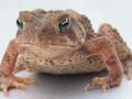
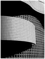
| 09/24/2003 07:32:32 AM |
Confused Toadby CoopsComment: OK, this pic isn't by any means the best, and yes it is small -- but I'll tell you this right now, for whatever it's worth: it simply is NOT deserving of 22-1s, 28-2s, and 43-3s. When I was voting, I was a pretty harsh voter, but that's simply ridiculous... |
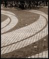
| 09/03/2003 01:04:07 PM |
Color Erasersby kim100878Comment: OK, yeah, there are some problems with this -- but I like it. It certainly doesn't deserve to be this far down in the heap.
I think the biggest single thing that could have made it stronger would be a cleaner background. If that was a nice solid black, with the funky erasers on top (I like the harsh color transitions), it would have looked more intentional and less accidental. (Not saying the look was accidental, just that was how it was perceived.) |
 Photographer found comment helpful. Photographer found comment helpful. |
| 09/03/2003 12:51:48 PM |
|
| 04/02/2003 10:02:10 AM |
|
| Photographer found comment helpful. |
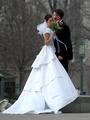
| 02/21/2003 05:16:50 AM |
A New Beginning by YomiComment: Hey, I wonder exactly where THAT was taken. ;-) Nice shot and congrats. |
| Photographer found comment helpful. |
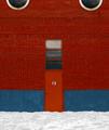
| 01/28/2003 08:11:36 AM |
Door #13by zadoreComment: I like it -- I think it could use some tweaks here and there -- but I like it. The horizontal lines near the bottom of the shot seem to be perfectly horizontal, but they're off just enough to notice as you look at them higher up the wall. The red and blue seems to be just a touch dark or maybe flat -- it's hard to adjust the whole photo to fix those without blowing out the snow, but since you were allowed unbounded Photoshop tweaks, that should be easy to overcome (as with the fixing the lines to horizontal). Love the symmetry, and the half windows at the top. |
| Photographer found comment helpful. |
| 01/28/2003 08:05:25 AM |
Wall of Windowsby NatashaComment: Great contrast and love the sinuous lines of the shot. It makes an excellent abstract. There are nits, and I don't know that you can do anything about them, but I'll point them out anyway. All of these beautiful clean lines are broken up by that wire (?) in the upper right corner -- go cut it down. ;-) There are also some strange shadows -- perhaps cast by the same wire, or by cousins orwho knows in the window section -- these are much less distracting than that wire. There are some ways, not too hard to use, to get rid of all of those problems if you'd like some help. |
| Photographer found comment helpful. |
| 01/28/2003 07:55:41 AM |
Window on Governmentby falveyComment: I'm trying to determine if the "yellow" along the very top of the shot disturbs me or not -- I guess if I have to question it, it does somewhat. I do like how it echoes the color of the stars at the top of the cuppola, but I think it might have been more effective to leave it off. Which, admittedly would have thrown off the rest of the composition unless you moved a little more to the center and got a bit more roof along the top of the shot. Otherwise, the right to left symmetry of the shot works well as does the verall exposure. |
| Photographer found comment helpful. |
| 01/28/2003 07:52:25 AM |
Window to heavenby amonteforteComment: The angles on this seem strange -- I'm guessing because you were trying to get those great clouds "perfectly" in the shot. Nothing seems to perfectly line up with any of the shot's edges (though that may be an optical illusion along the top and bottom). But it's the sides of the shot -- the slight angle on the left and the sharper angle on the right that disturb me -- as well as the way the window edges were cropped off on the right hand side but remain on the left. Basically, the composition just feels unbalanced all around. |
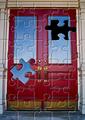
| 01/28/2003 07:49:30 AM |
Puzzling Doorby DougPazComment: I have a number of comments and I hope they don't come across too harshly. First, I'm not sure if the photo itself has that much interest to it. Second, there are a number of filters that shouldn't be used except in extreme cases and usually only with a lot of other work involved -- I think maybe the puzzle filter is one of them. Finally, the selection around the puzzle piece is a little rough -- it may be that you need to spend a little more time learning how to use those selection tools. Generally speaking, humans want to see light from the top down (something we're conditioned to because of the sun) -- so while the drop shadow on the puzzle piece was a nice idea, you might want to switch it so that it's on the opposite ("bottom") side of the piece -- which it looks like would help it match the lighting on the rest of the puzzle pieces. |
Home -
Challenges -
Community -
League -
Photos -
Cameras -
Lenses -
Learn -
Help -
Terms of Use -
Privacy -
Top ^
DPChallenge, and website content and design, Copyright © 2001-2025 Challenging Technologies, LLC.
All digital photo copyrights belong to the photographers and may not be used without permission.
Current Server Time: 04/11/2025 04:40:43 PM EDT.