| Author | Thread |
|
|
02/09/2003 03:42:21 PM |
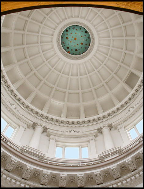
First, I have to say I liked this photo right away, the first place my eyes went to was the green "starry sky" in the middle of the dome. I also noticed how well it was focused and how the lighting was perfect.
After that I began to see ways this might have been a better photo. Was there any way to avoid the wood section at the top of the photo? It seems to distract. Was there a way to get a wider angle of the dome? Maybe to get all of the dome in the photo instead of part of it. I don't know, maybe your camera would not accomadate that, or maybe it was just not your intention. Overall a nice shot, I would have been proud if it had been mine. |
|
Comments Made During the Challenge  |
|
|
02/02/2003 10:47:42 PM |
|
|
|
02/02/2003 01:51:57 PM |
| Very grand. Are those stars always there at the top? Looks a bit.... odd. And what is that at the top edge of the photo? The composition is nice and the lighting is beautiful and diffuse. |
|
|
|
02/02/2003 01:14:10 PM |
| i predict this shot will do very well. i dont know if i like the lip of the cupola visible in the top of the frame tho ... |
|
|
|
02/02/2003 08:51:45 AM |
| Quite appealing and meets the challenge. Exposure is very good. |
|
|
|
01/30/2003 01:30:00 PM |
| I'm on my second look at this, and have to tell you that I will be rating it higher. The composition is wonderful, the whole photo is sharp and clear, really bringing out the incredible architectural detail. The lighting is wonderful, but then I am assuming that the lighting was already done for you!! A plesure to look at, I hope you place very high with this. |
|
 Photographer found comment helpful. Photographer found comment helpful. |
|
|
01/29/2003 11:58:34 PM |
|
|
|
01/28/2003 10:38:34 PM |
| Lovely contours and patterns here, great focus. Not sure that I like the brown bit at the top but it does add contrast to the colours. Good Luck |
|
|
|
01/28/2003 06:31:24 PM |
| Neat. Looks like a big funky eye. I love it. Looks like Gordon's shot for archicecture. Good job. 9 |
|
|
|
01/28/2003 12:55:41 PM |
| I'm trying to determine if the "yellow" along the very top of the shot disturbs me or not -- I guess if I have to question it, it does somewhat. I do like how it echoes the color of the stars at the top of the cuppola, but I think it might have been more effective to leave it off. Which, admittedly would have thrown off the rest of the composition unless you moved a little more to the center and got a bit more roof along the top of the shot. Otherwise, the right to left symmetry of the shot works well as does the verall exposure. |
|
| Photographer found comment helpful. |
|
|
01/27/2003 10:15:18 PM |
| beautiful image, i would like to have seen it either centered or more off center. |
|
|
|
01/27/2003 03:58:57 PM |
| I love how this looks like a human eye. Your depth of field and clearity are excellent. Your color tones and lighting are perfect! Great job! |
|
|
|
01/27/2003 02:05:02 AM |
| okay windows, and where are the doors? |
|
Home -
Challenges -
Community -
League -
Photos -
Cameras -
Lenses -
Learn -
Help -
Terms of Use -
Privacy -
Top ^
DPChallenge, and website content and design, Copyright © 2001-2026 Challenging Technologies, LLC.
All digital photo copyrights belong to the photographers and may not be used without permission.
Current Server Time: 02/01/2026 11:43:44 AM EST.