| Image |
Comment |
| 11/06/2005 08:24:46 PM |
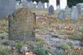
Sarah Badgerby 77LTDComment: The idea is solid, but the colors are rather washed-out and the lighting seems too flat. Altering the saturation and contrast would have made this image significantly more interesting.
|
 Photographer found comment helpful. Photographer found comment helpful. |
| 11/06/2005 08:22:35 PM |
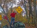
At the Dead Endby stare_at_the_sunComment: This is an interesting shot, but your ghost stayed in the frame too long; aside from his legs he looks too solid.
|
| Photographer found comment helpful. |
| 11/06/2005 08:20:35 PM |
|
| Photographer found comment helpful. |
| 11/06/2005 08:19:20 PM |
Journey's Endby KOKOCATComment: The intended message is clear, but the composition isn't particularly interesting and the focus is rather soft.
|
| Photographer found comment helpful. |
| 11/06/2005 08:17:42 PM |
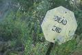
abusedby melodeeComment: The low saturation on the sign contrasts too strongly with the relatively lush looking vegetation. Since this was an advanced editing challenge you might have tried masking the sign, inverting the selection and burning the background, then hue shifting the color of the sign toward a rusty red.
|
| Photographer found comment helpful. |
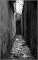
| 11/06/2005 08:15:06 PM |
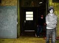
Untitledby TiberiusComment: This image lacks any clear subject. If the door at the end of the alley is the intended foal point using a shallower DoF would have helped to direct the viewer's attention there. |
| Photographer found comment helpful. |
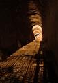
| 11/06/2005 08:13:29 PM |
Imprisonedby wetlandComment: As long as you could keep it recognizable I think that having the shadow of a person in a fetal position against the bars or at the end of the tunnel would have added an extra punch to this strong image.
|
| Photographer found comment helpful. |
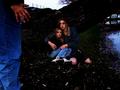
| 11/06/2005 08:11:06 PM |
TRAPPED!by NeuferlandComment: The looks on the faces of the female models make this feel more like a high school play than a genuinely tense situation. Obscuring the model's faces may have let the strength of the situation shine through. The bright areas along the top and right edges of the frame lead my eyes away from the intended subject. Since this was an advanced editing challenge selectively darkening these areas would have been allowed, and probably would have improved the image.
|
| Photographer found comment helpful. |
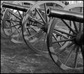
| 11/06/2005 08:05:14 PM |
...of the cannonby mcrochipComment: The cannons behind the one in the foreground lead my eyes out of the image. Photographing this from in front of one of the cannons would have avoided this problem.
|
| Photographer found comment helpful. |
| 11/06/2005 08:03:06 PM |
Dead End! Now What?by echo54Comment: This image implies a story, but while showing the person outside the car scratching their head does convey the intended idea, it seems like overacting. Taking the picture of the sign from the back seat with the man visible in the front seat with a crumpled up map on the dashboard would have felt more natural (well, as natural as an image of a guy consulting a map can look). I think that a more interesting story could be told if you'd have shot this from a lower angle and shown the front of the car on a jack with the person changing the tire, with airline tickets sticking out of his back pocket and the sign in the background.
|
| Photographer found comment helpful. |
Home -
Challenges -
Community -
League -
Photos -
Cameras -
Lenses -
Learn -
Help -
Terms of Use -
Privacy -
Top ^
DPChallenge, and website content and design, Copyright © 2001-2025 Challenging Technologies, LLC.
All digital photo copyrights belong to the photographers and may not be used without permission.
Current Server Time: 04/13/2025 10:28:57 AM EDT.