| Author | Thread |
Comments Made During the Challenge  |
|
|
11/13/2005 04:29:26 PM |
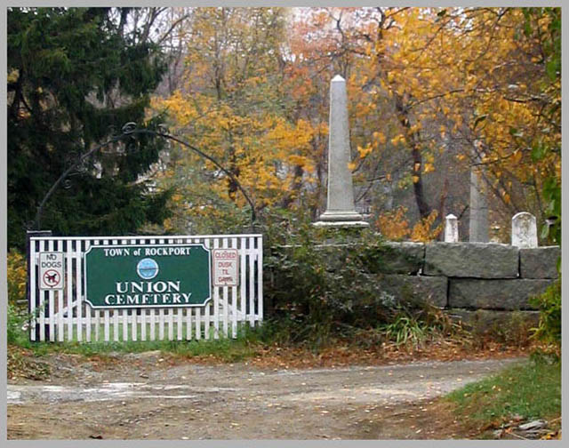
Image looks noisy, like it's over-compressed or something (perhaps when you were resizing in PS?). The grey border doesn't really add to it. There's also no main focus... Is it the gate or that column in the middle?
The lighting is okay though. Overall I would have preferred to see one main subject. If it's the gate, then change where you're standing to focus the attention on it. |
|
|
|
11/12/2005 06:56:49 AM |
| I think had this been more in focus, I would have given you one more point. I like your composition though. |
|
|
|
11/12/2005 03:57:30 AM |
| The composition is ok but it's not in focus. |
|
|
|
11/10/2005 04:25:32 PM |
| suffers from some low res. i ssues that make it unclear....other wise would be nice to see it with out the boarder and slightly darker, but it could be my screen |
|
 Photographer found comment helpful. Photographer found comment helpful. |
|
|
11/08/2005 05:27:59 PM |
| I love fall cemetary photos but this is out of focus and dull. It would have been better to get inside the cemetary and leave the sign out. |
|
| Photographer found comment helpful. |
|
|
11/08/2005 09:18:49 AM |
| I think that this could have been a better picture without the signpost and the road. |
|
| Photographer found comment helpful. |
|
|
11/07/2005 12:00:46 PM |
|
| Photographer found comment helpful. |
|
|
11/06/2005 08:19:20 PM |
The intended message is clear, but the composition isn't particularly interesting and the focus is rather soft.
|
|
| Photographer found comment helpful. |
Home -
Challenges -
Community -
League -
Photos -
Cameras -
Lenses -
Learn -
Help -
Terms of Use -
Privacy -
Top ^
DPChallenge, and website content and design, Copyright © 2001-2025 Challenging Technologies, LLC.
All digital photo copyrights belong to the photographers and may not be used without permission.
Current Server Time: 04/08/2025 01:38:23 AM EDT.