| Image |
Comment |
| 12/20/2005 07:25:55 PM |
Doriphobiaby YoungerComment: The idea isn't bad, but the execution leaves something to be desired. It looks like this was thrown together in a couple of minutes. More purposeful lighting would have really helped here.
|
 Photographer found comment helpful. Photographer found comment helpful. |
| 11/06/2005 08:52:30 PM |
End of The Trailby pedahel7Comment: This feels more like a snapshot than a challenge entry. Shooting this from a lower angle and with the kid either standing tall in the foreground or running toward the far side of the fence would have improved the image.
|
| Photographer found comment helpful. |
| 11/06/2005 08:50:18 PM |
Submissionby graphicfunkComment: The pose and lighting are interesting, but I can't quite tell what's going on here.
|
| Photographer found comment helpful. |
| 11/06/2005 08:47:36 PM |
Restby tjmuellerComment: The PoV is interesting, but the image lacks a clear focal point.
|
| Photographer found comment helpful. |
| 11/06/2005 08:46:34 PM |
a colorful endingby coolharComment: The sign is fairly well camouflaged in the tree. Since this was an advanced editing challenge masking off the sign and shifting the hue of the tree would have been allowed; doing so would have helped the sign to pop out.
|
| Photographer found comment helpful. |
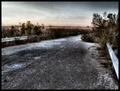
| 11/06/2005 08:44:11 PM |
Autumn impasseby nico_blueComment: The saturation seems a little overdone. I would have preferred to see more detail in the leaves and grass. The USM / sharpening artifacts are fairly obvious; if you sharpened before you resized then you may want to try resizing first.
|
| Photographer found comment helpful. |
| 11/06/2005 08:39:23 PM |
|
| Photographer found comment helpful. |
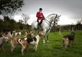
| 11/06/2005 08:37:21 PM |
Dead End ... for a foxby FalcComment: The border between the sky and the rest of the image is too sharp - try feathering your edges when you mask the sky. Since this was an advanced editing challenge, burning the sky to give it more depth would have been allowed. The DoF seems to be centered on the dogs; I think that the image would have been stronger if the focal point was the figure on the horse.
|
| Photographer found comment helpful. |
| 11/06/2005 08:31:22 PM |
End of the Roadby gurlwithapenComment: I like this image, but I would prefer to have a clear focal point (a bent license plate, discarded shoe, tire tracks, etc.). Adding noise was a good idea, but it looks like you compressed it too much. Since you're still well under the 250K limit you would have been better off submitting a larger file with the noise intact.
|
| Photographer found comment helpful. |
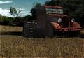
| 11/06/2005 08:27:28 PM |
Out to Pastureby JutildaComment: The image is nice, but you used way too much USM when sharpening this image. The colors on the near side of the truck also look odd. Did you pull all of that detail out of a nearly black shadow? Burning the sky a bit would have reinforced the moody feel of this image.
|
| Photographer found comment helpful. |
Home -
Challenges -
Community -
League -
Photos -
Cameras -
Lenses -
Learn -
Help -
Terms of Use -
Privacy -
Top ^
DPChallenge, and website content and design, Copyright © 2001-2025 Challenging Technologies, LLC.
All digital photo copyrights belong to the photographers and may not be used without permission.
Current Server Time: 04/13/2025 01:15:03 AM EDT.