| Image |
Comment |
| 12/20/2005 08:06:06 PM |
|
 Photographer found comment helpful. Photographer found comment helpful. |
| 12/20/2005 08:03:59 PM |
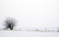
Thantophobia - fear of dyingby petrakkaComment: I like the image, but somehow the fence seems to detract from the image overall. The dead grass along the fence line does a nice job of grounding the tree. |
| Photographer found comment helpful. |
| 12/20/2005 08:02:16 PM |
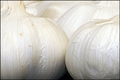
Alliumphobiaby snapzComment: Your image unambiguously defines the named phobia (unlike a lot of the other entries), but somehow the image doesn't strike me as noteworthy. There's nothing wrong with it, it's just not particularly interesting. |
| Photographer found comment helpful. |
| 12/20/2005 07:59:54 PM |
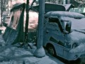
Frosty space From Coldby unknowndeathComment: I like the left half of the image, but I don't see any strong connection to the challenge topic. The image grain is a nice touch. |
| 12/20/2005 07:58:21 PM |
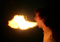
Electric Shockby GlouComment: The idea is great, but I think that the presentation would have been stronger if you'd have not blown out quite so many of the features. |
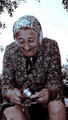
| 12/20/2005 07:53:53 PM |
Rhytiphobia- Fear of getting wrinkles.by popsicleComment: If wrinkles are the focal point then cropping to include only the woman's hands or face would have been more effective. As it is her busy shirt, the stitches in her knee, the knife, and the other incidental details cloud your message. |
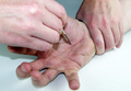
| 12/20/2005 07:51:45 PM |
fear of tortureby dippydazComment: The message-bearing portion of this image occupies relatively little area in this image. I think that your composition would get more bang for it's buck if you made the presentation more minimalistic (showing 13 fingers seems excessive). Since the message is less than happy using a darker background would have helped to create the appropriate atmosphere. Showing simply one finger with the blade poised to ram under the fingernail would have been a more concise way to convey the same idea. |
| Photographer found comment helpful. |
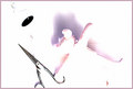
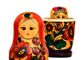
| 12/20/2005 07:41:31 PM |
Claustrophobiaby Robot-FotomatComment: Interesting take on the challenge. I like the eyes peering out of the larger matreshka (sp?) doll. The upper half in the foreground helps to clarify what the focal point is; without this it would have taken me longer to identify what I was looking at. The overlap between the doll in the foreground and the one in the back feels somewhat claustrophobic. This may or may not be intentional, but moving the foreground doll to the right would reduce the effect. The pure white background seems a little overbearing; I would have preferred a light shade of grey.
|
| Photographer found comment helpful. |
| 12/20/2005 07:35:57 PM |
|
| Photographer found comment helpful. |
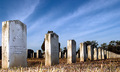
| 12/20/2005 07:34:04 PM |
Coimetrophobia- Fear of Cemeteriesby ShotMDComment: This image is pretty evenly divided between the sky and the foreground. I think that the composition would have been stronger if there was more emphasis on one or the other. Given the subject the colors are rather bright and cheery, but not enough to make it feel like an intentional contrast. I'd suggest adding some image grain and dropping the saturation a bit or trying to make the contrast between the happy colors and the sad subject feel more intentional.
The fact that the epitaph is legible on at least the first few tombstones ties the cometary to someplace in the southern U.S. Since the details about this particular cometary aren't relevant to your message about cemeteries in general, you might want to consider obscuring the locale specific details somehow (a wider angle shot, etc.).
|
| Photographer found comment helpful. |
Home -
Challenges -
Community -
League -
Photos -
Cameras -
Lenses -
Learn -
Help -
Terms of Use -
Privacy -
Top ^
DPChallenge, and website content and design, Copyright © 2001-2025 Challenging Technologies, LLC.
All digital photo copyrights belong to the photographers and may not be used without permission.
Current Server Time: 04/13/2025 01:11:17 AM EDT.