| Author | Thread |
Comments Made During the Challenge  |
|
|
12/27/2005 11:28:47 AM |
| Doesn't fit into challenge topic as no fear is shown or implied |
|
 Photographer found comment helpful. Photographer found comment helpful. |
|
|
12/27/2005 11:19:23 AM |
|
| Photographer found comment helpful. |
|
|
12/26/2005 11:46:29 PM |
| simple image done well...... |
|
| Photographer found comment helpful. |
|
|
12/26/2005 06:13:01 PM |
| I love the symmetry of this. |
|
| Photographer found comment helpful. |
|
|
12/26/2005 02:38:11 PM |
|
| Photographer found comment helpful. |
|
|
12/26/2005 01:48:36 PM |
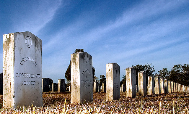
| It's a cemetery all right, but there's nothing about this that to me says "fear of cemeteries". Also seems like there's too much contrast or sharpening. |
|
| Photographer found comment helpful. |
|
|
12/25/2005 02:55:20 AM |
| nice shot, composition is good, it's a bit grainy, so either a high ISO or a low budget camera. could use some dodge/burn, but that's not allowed in basic editing... 7 |
|
| Photographer found comment helpful. |
|
|
12/25/2005 02:46:14 AM |
| Not nearly spooky enough to illustrate what you wrote in the caption. |
|
| Photographer found comment helpful. |
|
|
12/25/2005 02:11:44 AM |
|
| Photographer found comment helpful. |
|
|
12/24/2005 10:00:43 AM |
| IMO, you were on the right track by taking a photo in a cemetary. To convey a better sense of fear, a pic showing some of the more gothic markers would have been better. |
|
| Photographer found comment helpful. |
|
|
12/24/2005 06:24:27 AM |
|
| Photographer found comment helpful. |
|
|
12/23/2005 10:37:31 AM |
| Nice composition and sky. Good job. |
|
| Photographer found comment helpful. |
|
|
12/21/2005 08:38:54 PM |
| Good depth of field and focus. I think this might have been cooler in B&W....because, to me at least, the blue sky really takes away any real sense of fear in the picture. You get a 7 from me though...good pic. |
|
| Photographer found comment helpful. |
|
|
12/20/2005 07:46:00 PM |
|
|
|
12/20/2005 07:34:04 PM |
This image is pretty evenly divided between the sky and the foreground. I think that the composition would have been stronger if there was more emphasis on one or the other. Given the subject the colors are rather bright and cheery, but not enough to make it feel like an intentional contrast. I'd suggest adding some image grain and dropping the saturation a bit or trying to make the contrast between the happy colors and the sad subject feel more intentional.
The fact that the epitaph is legible on at least the first few tombstones ties the cometary to someplace in the southern U.S. Since the details about this particular cometary aren't relevant to your message about cemeteries in general, you might want to consider obscuring the locale specific details somehow (a wider angle shot, etc.).
|
|
| Photographer found comment helpful. |
Home -
Challenges -
Community -
League -
Photos -
Cameras -
Lenses -
Learn -
Help -
Terms of Use -
Privacy -
Top ^
DPChallenge, and website content and design, Copyright © 2001-2025 Challenging Technologies, LLC.
All digital photo copyrights belong to the photographers and may not be used without permission.
Current Server Time: 04/07/2025 09:11:47 PM EDT.