| Image |
Comment |
| 04/22/2009 07:26:48 PM |
Colorby landon1013Comment by rodfulk: From Critique club:
I think JMO you might have problem with the compostion. There is no set pattern or rhythm to your image other than the star layout.
Main object has unequal spacing.
Perhaps a higher POV would have helped also. Maybe a shot from above the image. that way you could have used your DOF to keep everything more focused. |
 Photographer found comment helpful. Photographer found comment helpful. |
| 04/19/2009 05:43:34 PM |
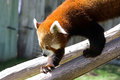
Red Pandaby landon1013Comment by Teafran: The natural lighting on the subject is a little overdone leading to an awkward transition from light to dark. The lighter shade on the tree limb is distracting and does not enhance the image in any way. A little more thought into the composition would have produced a more effective image. |
| Photographer found comment helpful. |
| 04/17/2009 12:33:01 AM |
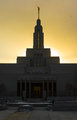
Welcome to Utahby landon1013Comment by Citadel: Greetings from the critique club!
With this image placing the sun behind the subject could work if some dodging was done on the foreground to brighten it up. The spot in the top right corner could be removed even if it was snow. Both of these steps are legal under advanced but not under basic. (In basic you could clone out the spot if it was dust however).
It appears there was an attempt to make a symmetrical image but its just off enough to bother the viewer.
|
| Photographer found comment helpful. |
| 04/15/2009 09:24:05 AM |
|
| Photographer found comment helpful. |
| 04/15/2009 04:14:28 AM |
Colorby landon1013Comment by jdixonsd: Nice shot, the left side of the photo should have been croped more, the crayons should have been more evenly spaced. JMO! |
| Photographer found comment helpful. |
| 04/14/2009 01:44:07 PM |
Colorby landon1013Comment by desertsnail: not a bad shot, but the image seems a bit dark and flat. Your white point seems pretty gray and the colors could use a bit more "pop". It also might be nice to try an off center composition to add a bit of interest... Good luck for this challenge :) |
| Photographer found comment helpful. |
| 04/14/2009 06:58:34 AM |
Colorby landon1013Comment by drewhosick: The colors just don't pop out at me on this shot. Maybe a bit more saturation? Brighter too? It could be that the background being darker than a bright white just doesn't allow the colors to really pop out as much. |
| Photographer found comment helpful. |
| 04/14/2009 06:44:30 AM |
Colorby landon1013Comment by Ja-9: well, this isn't bad, but it's not grand in comparison...you have a funny shadow on the tip of your red crayon that distracts from your shot, and I would like to see more of your subject in sharper focus...IMO (which does not count) |
| Photographer found comment helpful. |
| 04/13/2009 01:34:07 PM |
Colorby landon1013Comment by Teafran: The image meets the subject matter dead on. A sound demonstration of the creative process in meeting the challenge in a very unusual way. A couple of minor detail problems as the image appears to be less than sharp. The DOF could have been used more effectively. A good solid entry into the challenge. |
| Photographer found comment helpful. |
| 04/13/2009 08:53:37 AM |
Colorby landon1013Comment by LadyK: this isn't really wowing me. maybe an empty space border would have helped(meaning space between the pencils and the frame) |
| Photographer found comment helpful. |
Home -
Challenges -
Community -
League -
Photos -
Cameras -
Lenses -
Learn -
Help -
Terms of Use -
Privacy -
Top ^
DPChallenge, and website content and design, Copyright © 2001-2025 Challenging Technologies, LLC.
All digital photo copyrights belong to the photographers and may not be used without permission.
Current Server Time: 04/07/2025 09:21:38 AM EDT.