| Author | Thread |
|
|
04/22/2009 07:26:48 PM |
From Critique club:
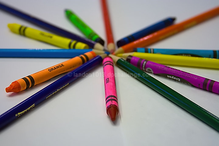
I think JMO you might have problem with the compostion. There is no set pattern or rhythm to your image other than the star layout.
Main object has unequal spacing.
Perhaps a higher POV would have helped also. Maybe a shot from above the image. that way you could have used your DOF to keep everything more focused. |
|
 Photographer found comment helpful. Photographer found comment helpful. |
Comments Made During the Challenge  |
|
|
04/15/2009 09:24:05 AM |
| nothing really pops and grabs the attention |
|
| Photographer found comment helpful. |
|
|
04/15/2009 04:14:28 AM |
| Nice shot, the left side of the photo should have been croped more, the crayons should have been more evenly spaced. JMO! |
|
| Photographer found comment helpful. |
|
|
04/14/2009 01:44:07 PM |
| not a bad shot, but the image seems a bit dark and flat. Your white point seems pretty gray and the colors could use a bit more "pop". It also might be nice to try an off center composition to add a bit of interest... Good luck for this challenge :) |
|
| Photographer found comment helpful. |
|
|
04/14/2009 06:58:34 AM |
| The colors just don't pop out at me on this shot. Maybe a bit more saturation? Brighter too? It could be that the background being darker than a bright white just doesn't allow the colors to really pop out as much. |
|
| Photographer found comment helpful. |
|
|
04/14/2009 06:44:30 AM |
| well, this isn't bad, but it's not grand in comparison...you have a funny shadow on the tip of your red crayon that distracts from your shot, and I would like to see more of your subject in sharper focus...IMO (which does not count) |
|
| Photographer found comment helpful. |
|
|
04/13/2009 01:34:07 PM |
| The image meets the subject matter dead on. A sound demonstration of the creative process in meeting the challenge in a very unusual way. A couple of minor detail problems as the image appears to be less than sharp. The DOF could have been used more effectively. A good solid entry into the challenge. |
|
| Photographer found comment helpful. |
|
|
04/13/2009 08:53:37 AM |
| this isn't really wowing me. maybe an empty space border would have helped(meaning space between the pencils and the frame) |
|
| Photographer found comment helpful. |
|
|
04/13/2009 06:32:56 AM |
| Pretty straight-forward and the white background seems a bit grey. |
|
| Photographer found comment helpful. |
Home -
Challenges -
Community -
League -
Photos -
Cameras -
Lenses -
Learn -
Help -
Terms of Use -
Privacy -
Top ^
DPChallenge, and website content and design, Copyright © 2001-2025 Challenging Technologies, LLC.
All digital photo copyrights belong to the photographers and may not be used without permission.
Current Server Time: 04/07/2025 02:40:35 PM EDT.